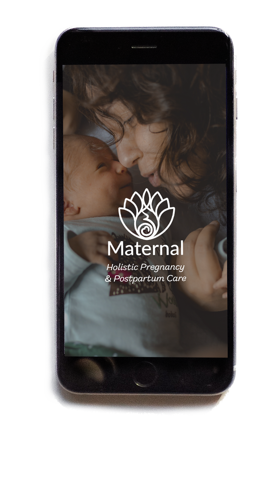
Maternal
UX Case Study
Objective
Design a responsive web application that connects expecting and new mothers with a virtual doula.
Role
Research, UX/UI Design, Testing
Tools
Lucidchart, Marvel, Optimal Workshop, Adobe XD, Adobe Photoshop, Slack, Zoom
background
This conceptual project was based on a brief to create a responsive website application that connects users with an expert so that they could ask questions and receive support. Since the type of expert was left up to me, I decided to narrow the scope and intended audience to make a more customized user experience.
Having a doula at the birth of my son was extremely beneficial and I knew that having the support of a doula during pregnancy has been shown to significantly improve outcomes for mother (and baby) during birth and postpartum.* So the concept for Maternal was born...no pun intended!
*Source: Gruber KJ, Cupito SH, Dobson CF. Impact of doulas on healthy birth outcomes. J Perinat Educ. 2013;22(1):49-58. doi:10.1891/1058-1243.22.1.49
understanding the problem
Keeping my focus wide and mind open to ideas, I brainstormed a list of possible problems and potential solutions before deciding on a direction from which to create my problem statement and hypothesis. I used the Double Diamond strategy because it allows you to go back in the process if you need to make adjustments and you don’t need to perfect the entire solution up front.
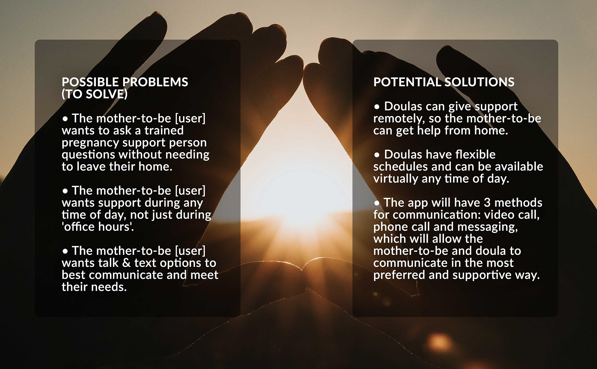
Problem Statement & Hypothesis
Maternal users need a convenient way to speak to a doula from the comfort of their home because they want ongoing guidance & support that doesn’t require an office visit each time they have a question.
We will know this to be true when we see Maternal app users leave positive feedback about the advice and support they received and the app gains popularity in downloads and usage.
Competitive analysis
I began by researching competitors to analyze how the information was presented, including navigation, content and features. I then created SWOT profiles and gathered my takeaways.
I learned that having a good onboarding process was key in educating users on the benefits of having a subscription and that offering a variety of subscription options would provide users with the most flexibility. I also learned that on-demand and live online classes could be a great resource for my user.

understanding the user
Interviews
After conducting interviews with 3 moms, I had some great takeaways to better determine our user needs and goals. One major takeaway was that the app needed a community feature so that users could connect with others going through similar journeys.
I also received feedback regarding education and resources the moms wish they had when they were pregnant, and what they liked about the information they sought. This was another opportunity that the app could provide.
Key Findings:
• Felt they needed additional information and support above what their doctor visits provided
• Regularly looked up information (at least weekly) about their pregnancy, planning for birth, what to expect at birth or their baby’s growth progress
• Strong preference to visuals (for information)
• Used progress trackers for their baby’s stage of growth while pregnant
• Valued the feedback of others who had gone through (or were going through) the same experience
• They generally knew what a doula was (even if they didn’t use one) and the idea of having that type of support person was valued favorably
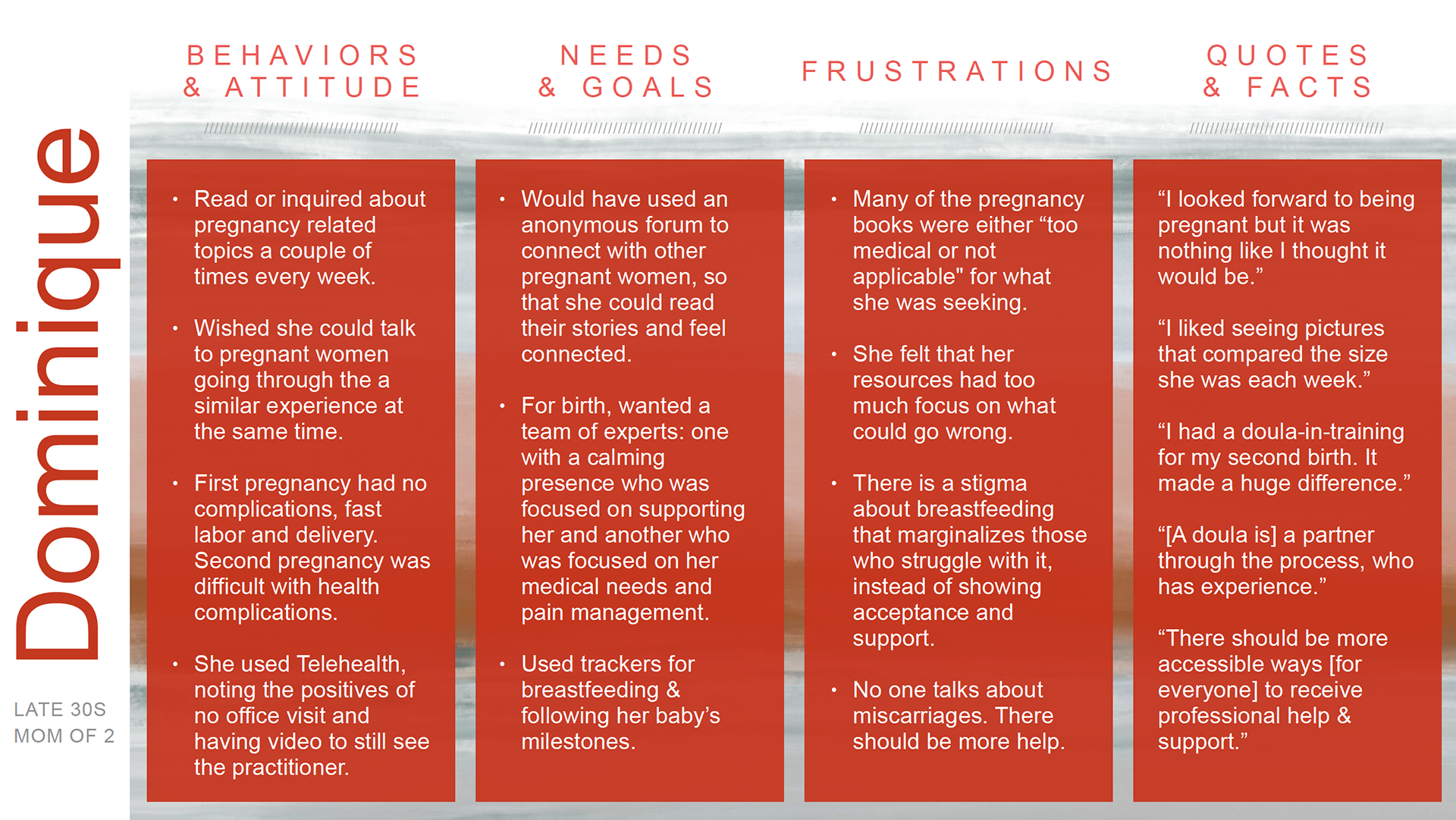
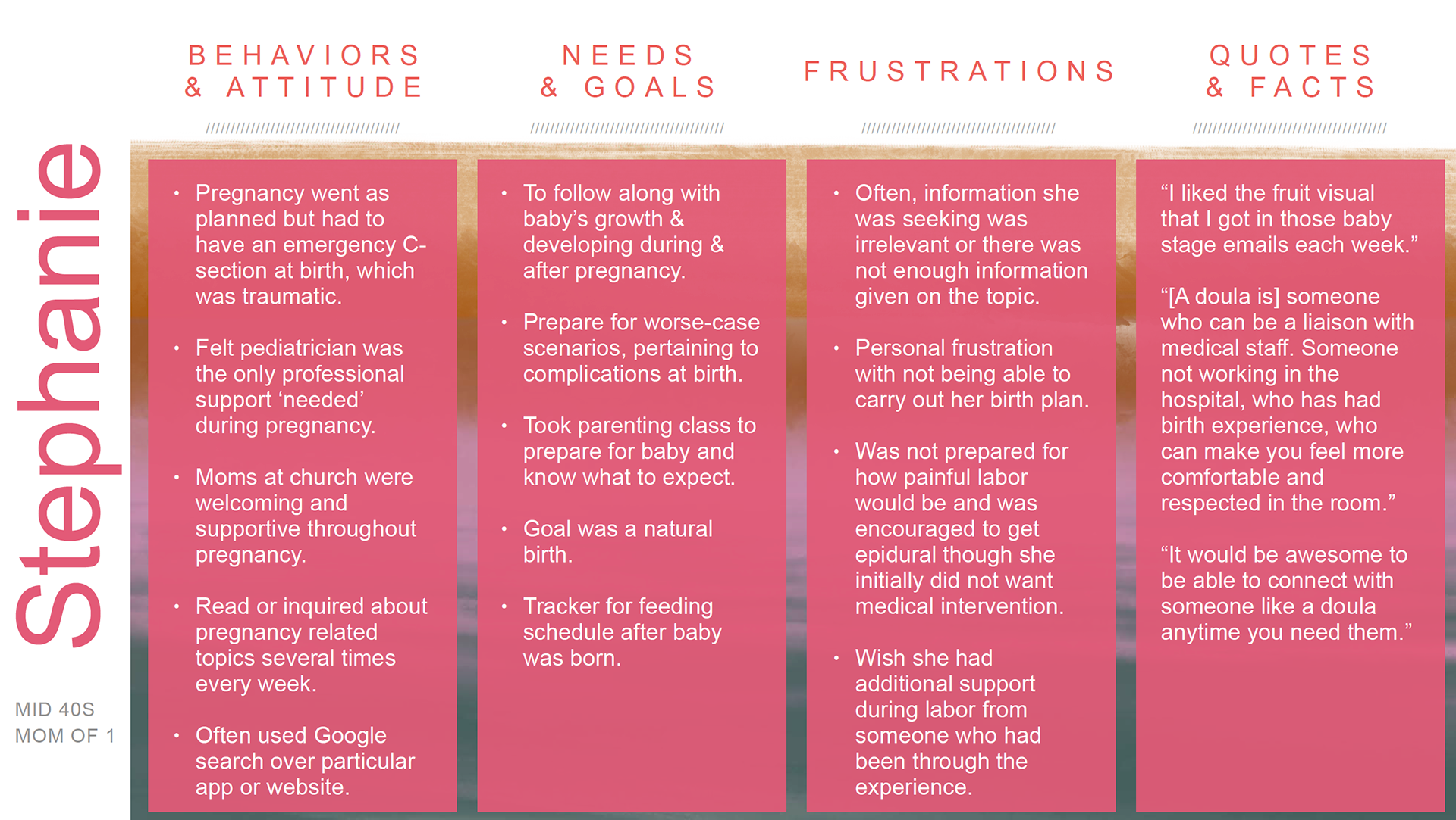
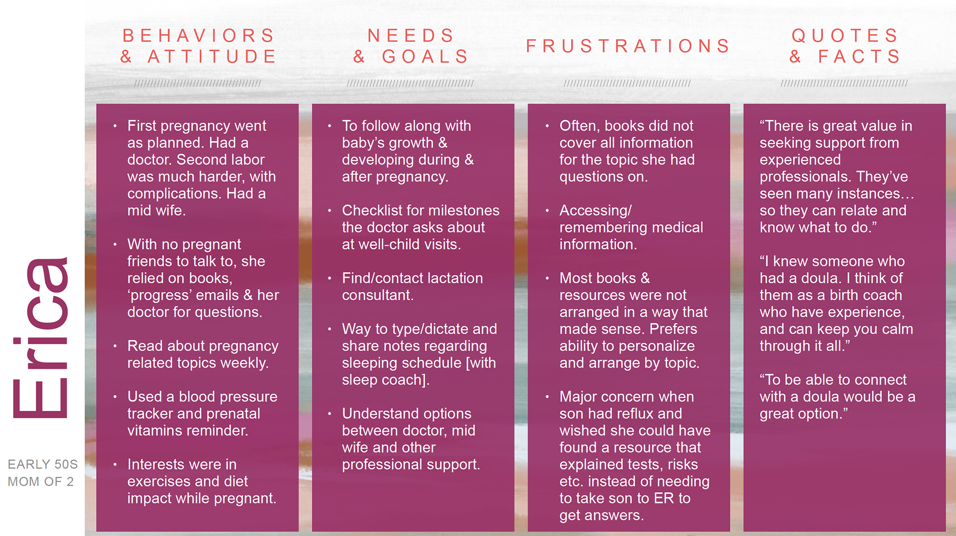
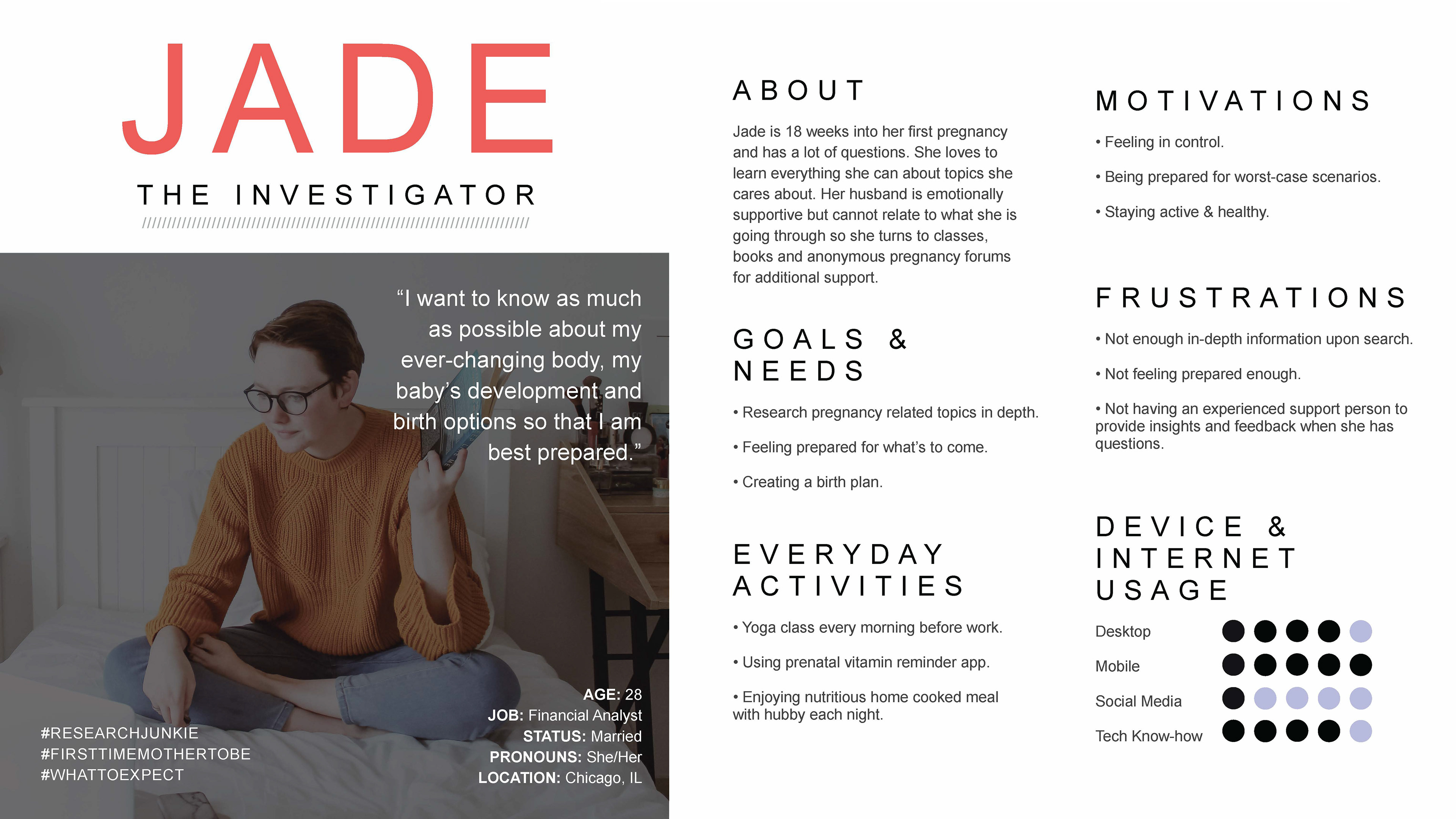
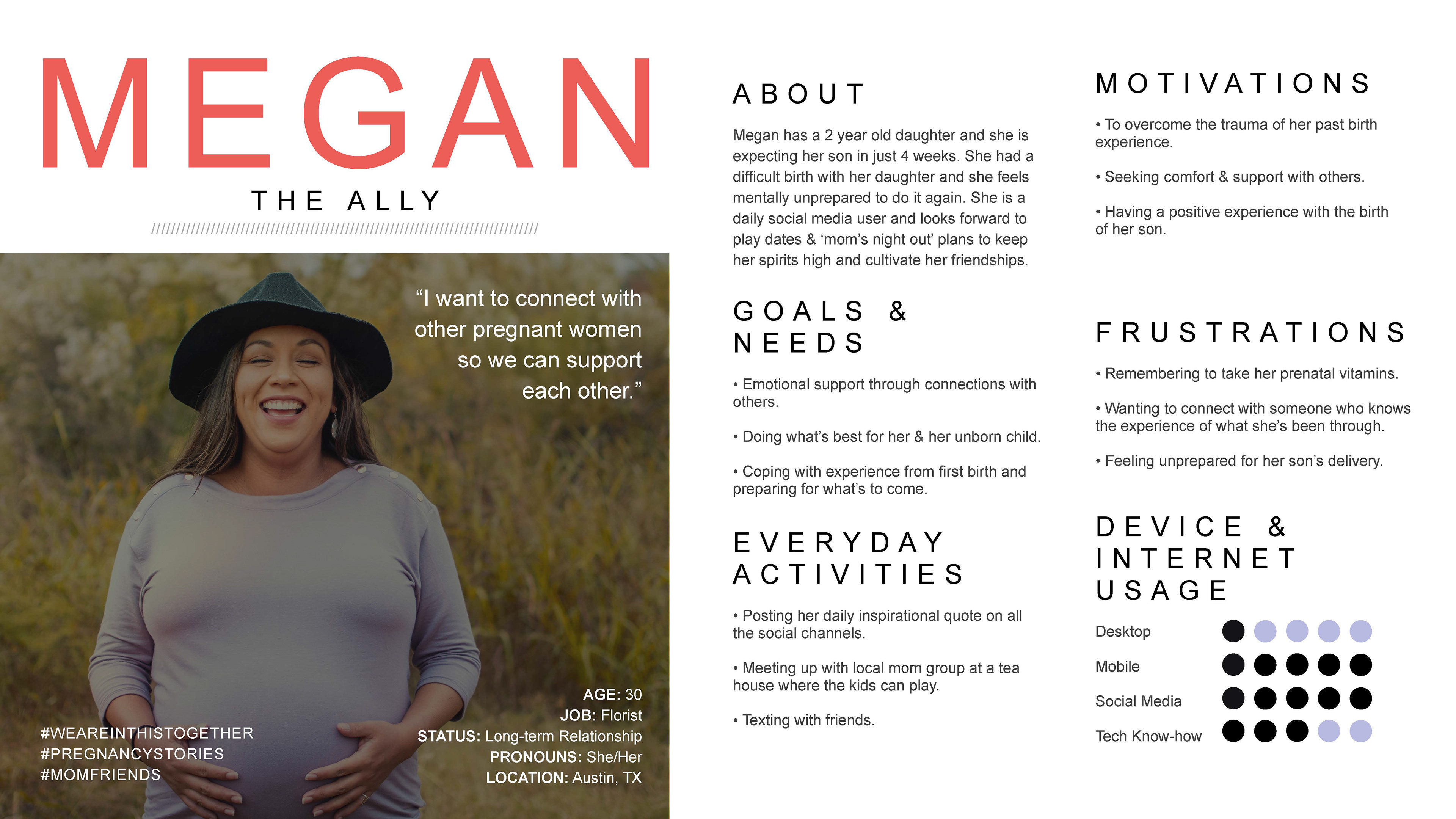
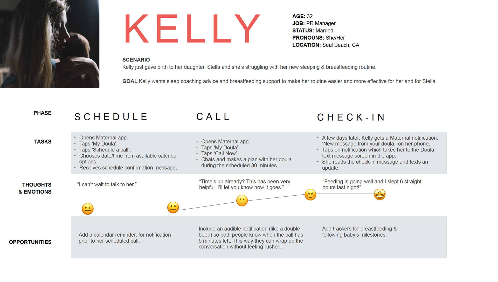
User Personas
Based on my interview findings, I concluded that there were 3 types of users to keep in mind while designing the app. I created personas for each of them to help me focus on fulfilling their needs in the most helpful & efficient way.

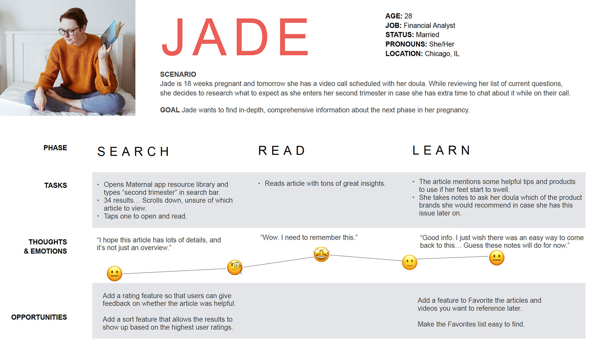
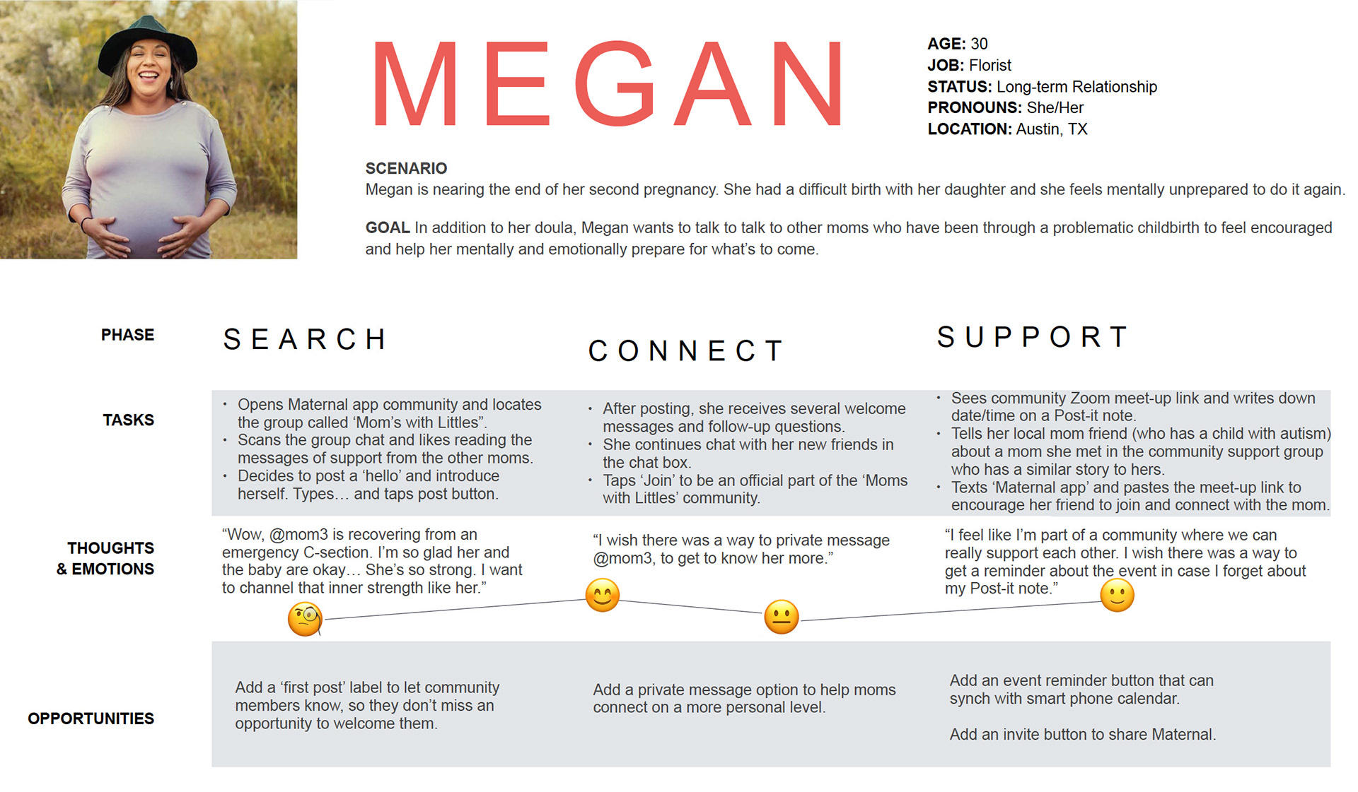
User Journey maps
Next, my goal was to convey a visual story of the process each of my personas would work through in order to accomplish a goal.
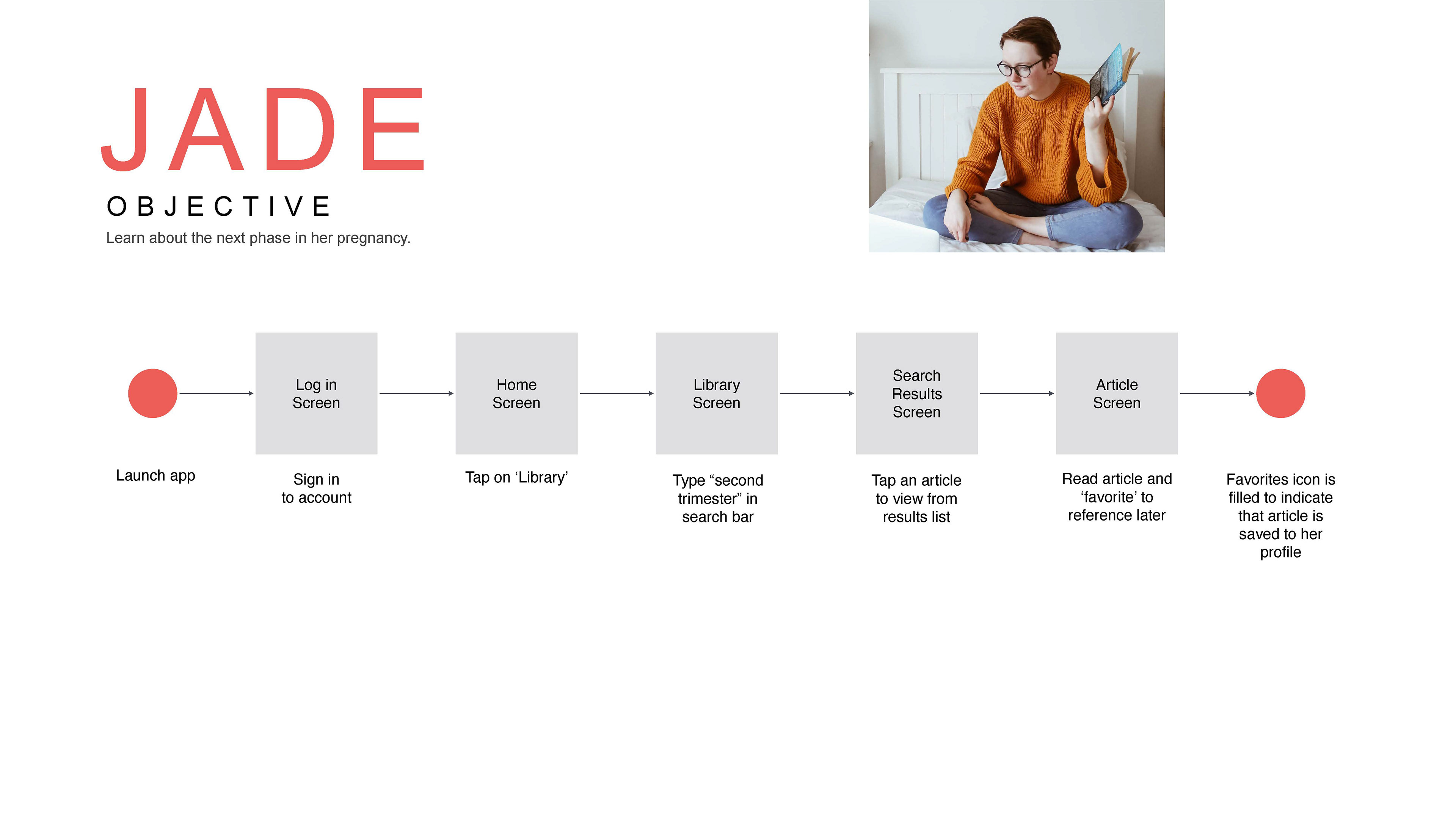
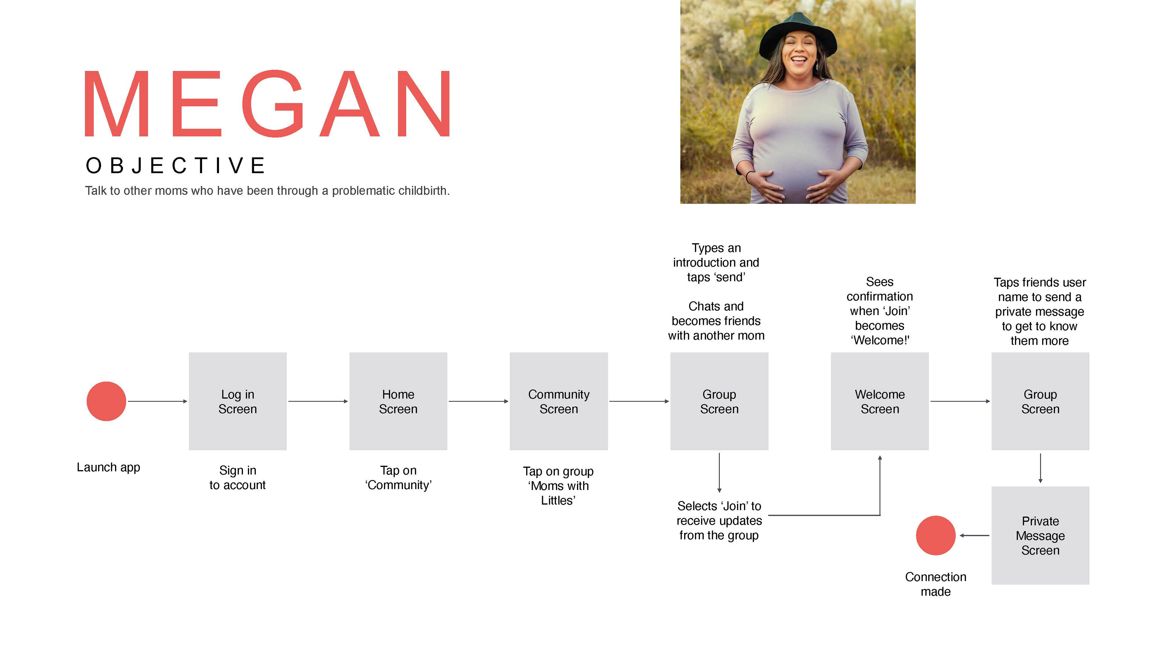
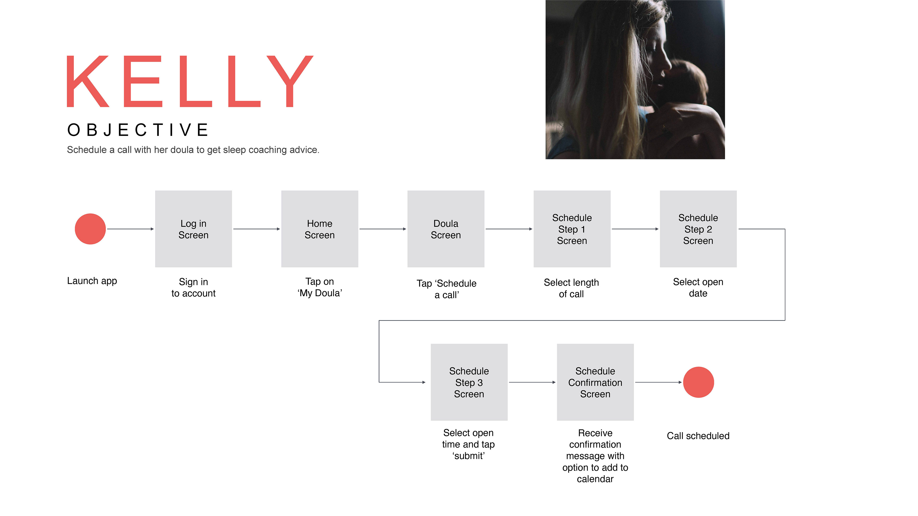
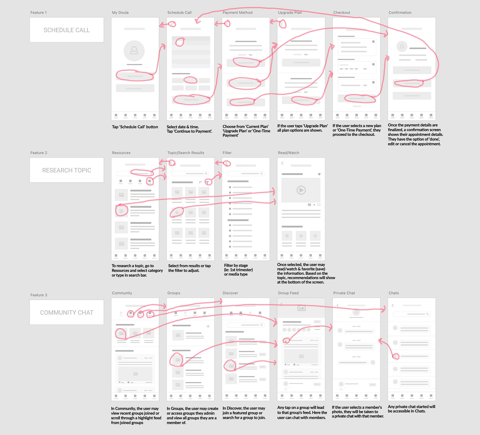
Task Flows
While considering the most efficient path to their goals, I created task flows for each feature our user would need: Schedule a Call (with their doula), Research a Topic & Chat with Community Members.
Information Architecture
I conducted an open card sorting exercise with 9 participants and 20 cards to organize the app's content. Per feedback from my original sitemap, I included some additional content such as Settings, Help & FAQs to ensure the most advantageous sort for my final sitemap.
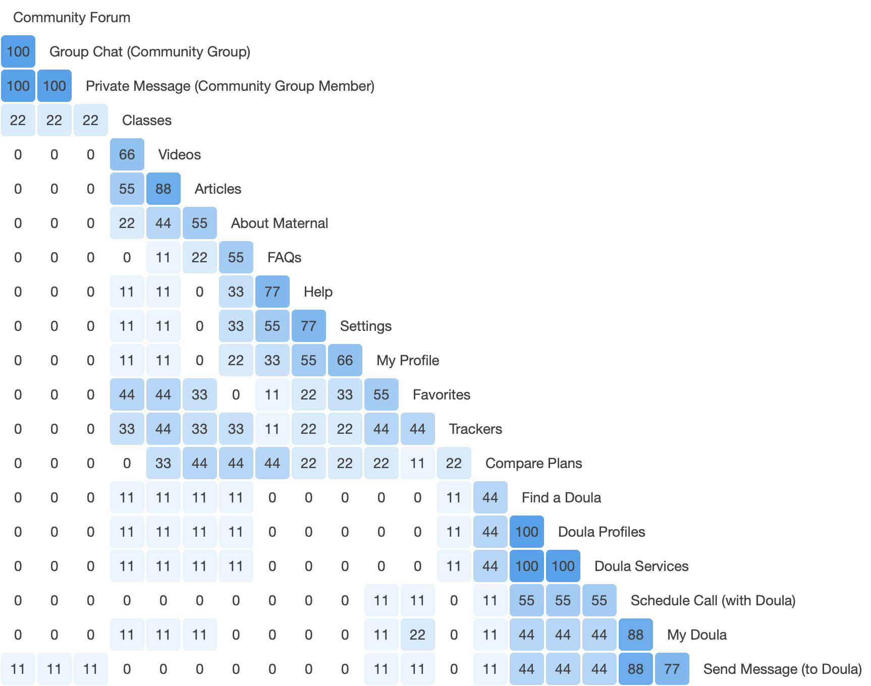
Similarity matrix (optimalsort)
Analyzing the results of similarity matrix, I found that most of the card groupings confirmed my preliminary sitemap. Some cards such as, Favorites, Trackers & Compare Plans were split pretty evenly so I went with the most likely choice.
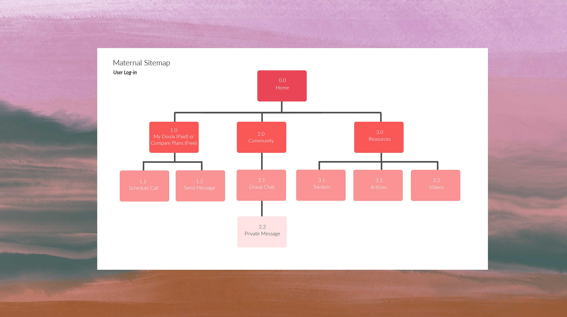
Sitemap - before card sort
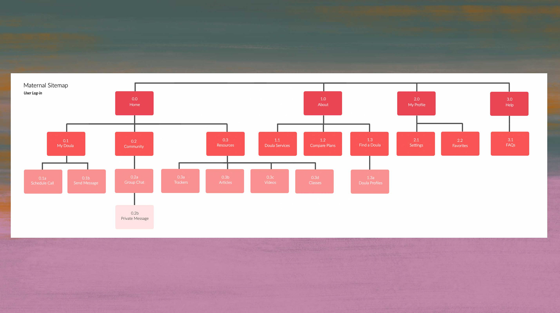
Sitemap - After card sort
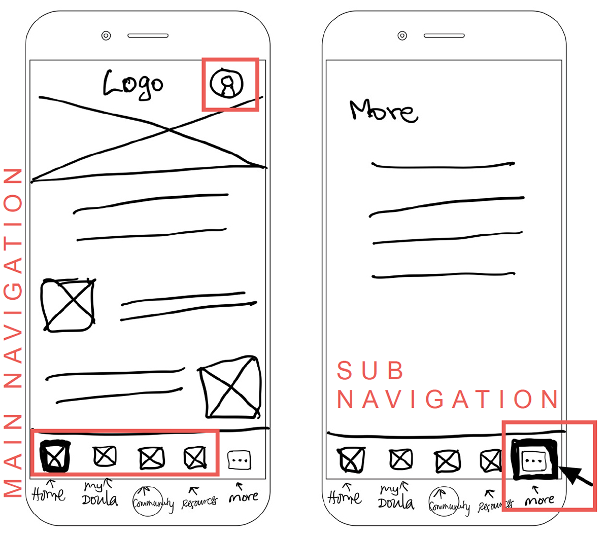
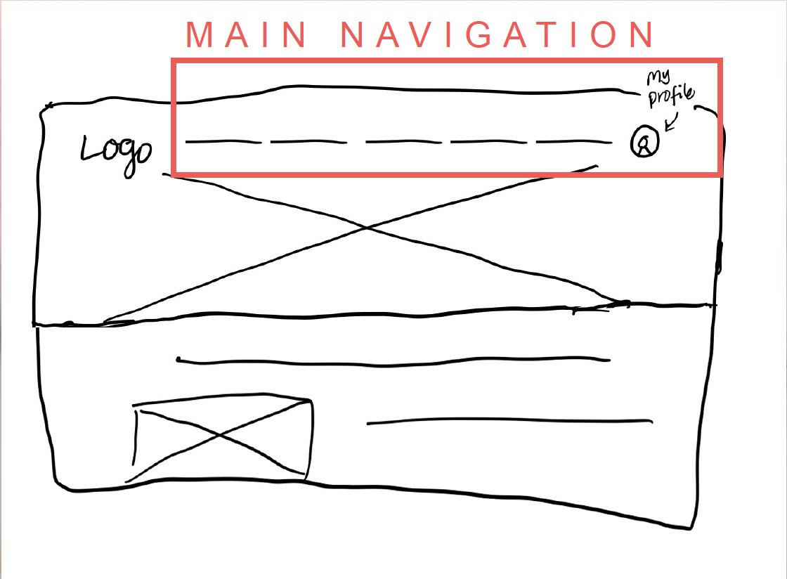
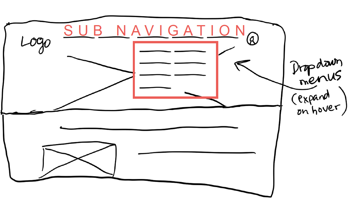
NAVIGATION
It was now time to sketch some initial wireframes for the site navigation. For mobile, I used a common heuristic approach, adding high-level navigation across the bottom of the application screen as a sticky tab bar.
The profile at the top right of the screen/page had a consistent navigation pattern across mobile and desktop.
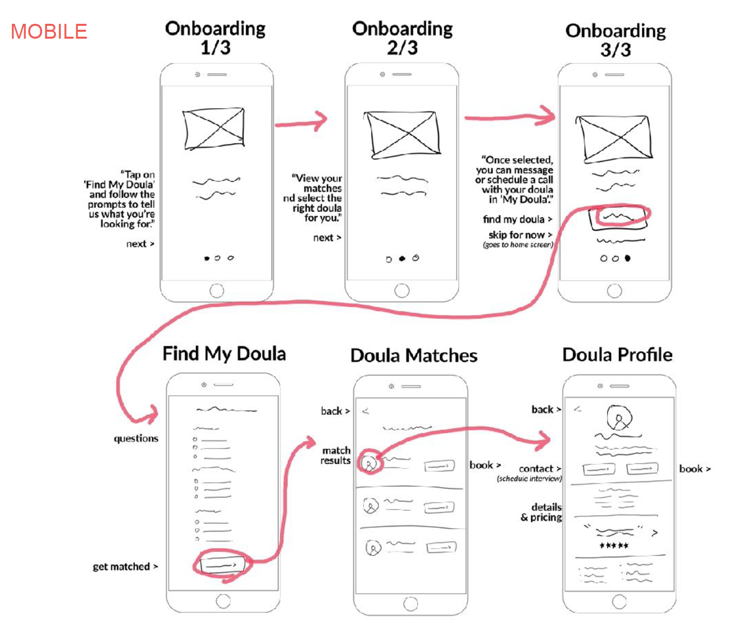
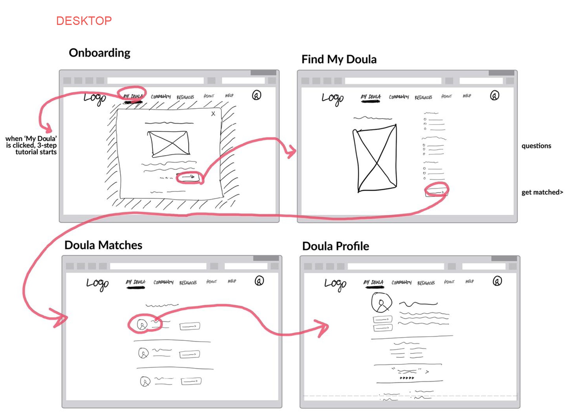
Low-fidelity wireframes
onboarding
I chose the swipe/tutorial method for onboarding to lead the user to their doula (and get the most benefit of the app) upon sign up. On the mobile app, onboarding appears immediately following sign up. The user can skip this step if desired. If they skip, they are taken to the home screen.
On the desktop, the onboarding tutorial appears if the user clicks on ‘My Doula’ in the nav and they do not already have a doula assigned. There are also callouts on the homepage to promote this feature/service.
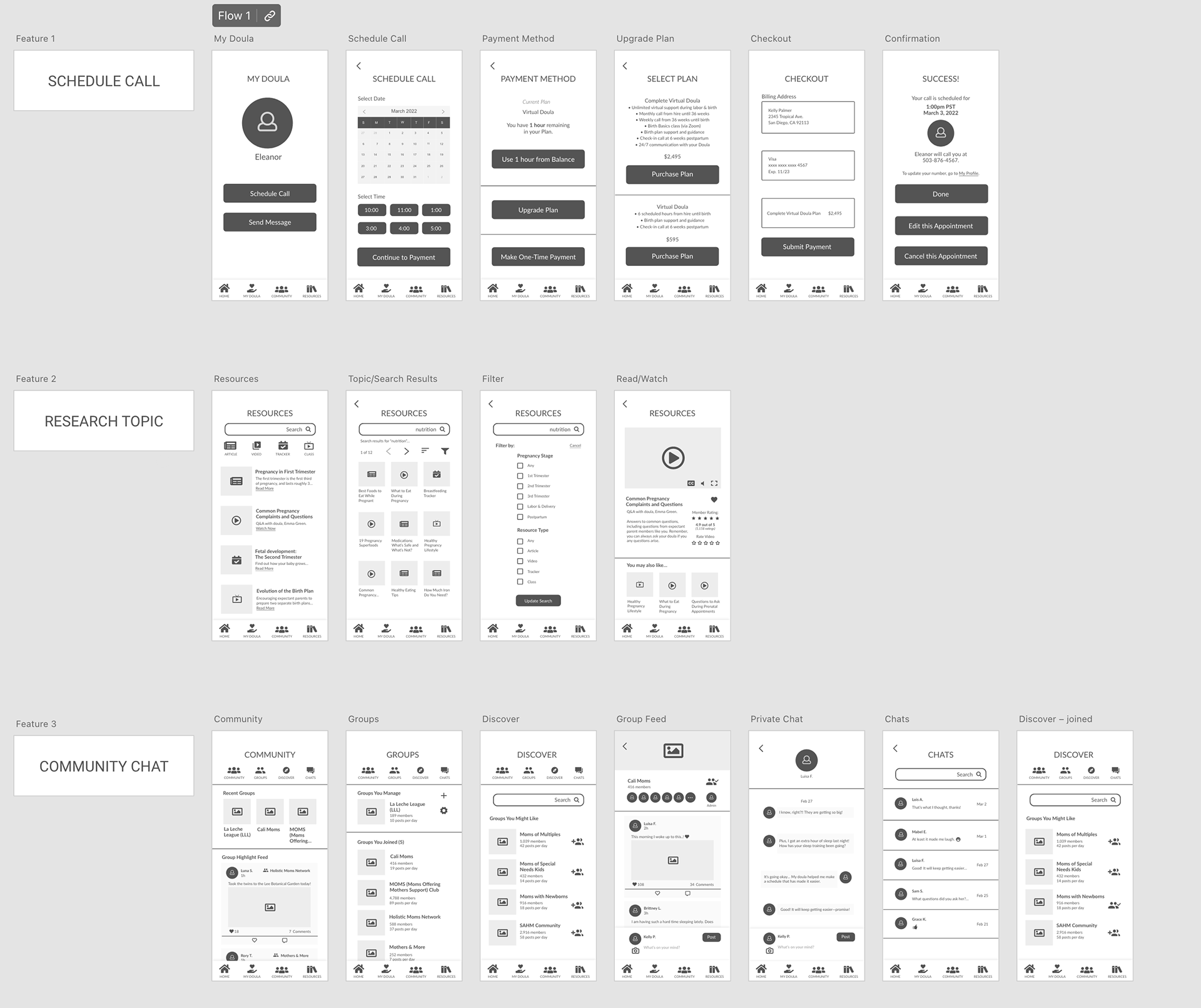
Mid-Fidelity Prototypes
Next, I brought my sketches to Adobe XD to better convey the form and function of the Maternal application features.
High-Fidelity Wireframes
Through each iteration, the design evolved and the processes were more clear. It was time to test the features and see if I was on the right track.
Usability Testing & Analyzing Results
With my test script ready and 6 participants scheduled, it was time to test the features of the app and make sure that they were easy to follow. All tests were conducted remotely over Zoom with 3 participants testing the mobile experience first and 3 testing the desktop experience.
Scenario Tasks:
1. You just found out that you are pregnant and have a lot of questions, including what foods would be best to eat and which ones to avoid. How would you search for ‘nutrition’ so that you can learn more?
2. You just gave birth to your daughter, and it’s been a challenge adjusting to a new sleep & feeding routine. You want to connect with other moms who know just how you’re feeling. How would you find a community group to chat with other moms?
3. You are nearing the end of your second pregnancy. After a difficult birth with your first, you are feeling mentally unprepared to do it again. You decide to schedule a call with your doula, Eleanor, so you can talk it through. How would you schedule a one hour call with Eleanor?
after the "big sort" (lucidchart)
Rainbow spreadSheet (Google Sheets)
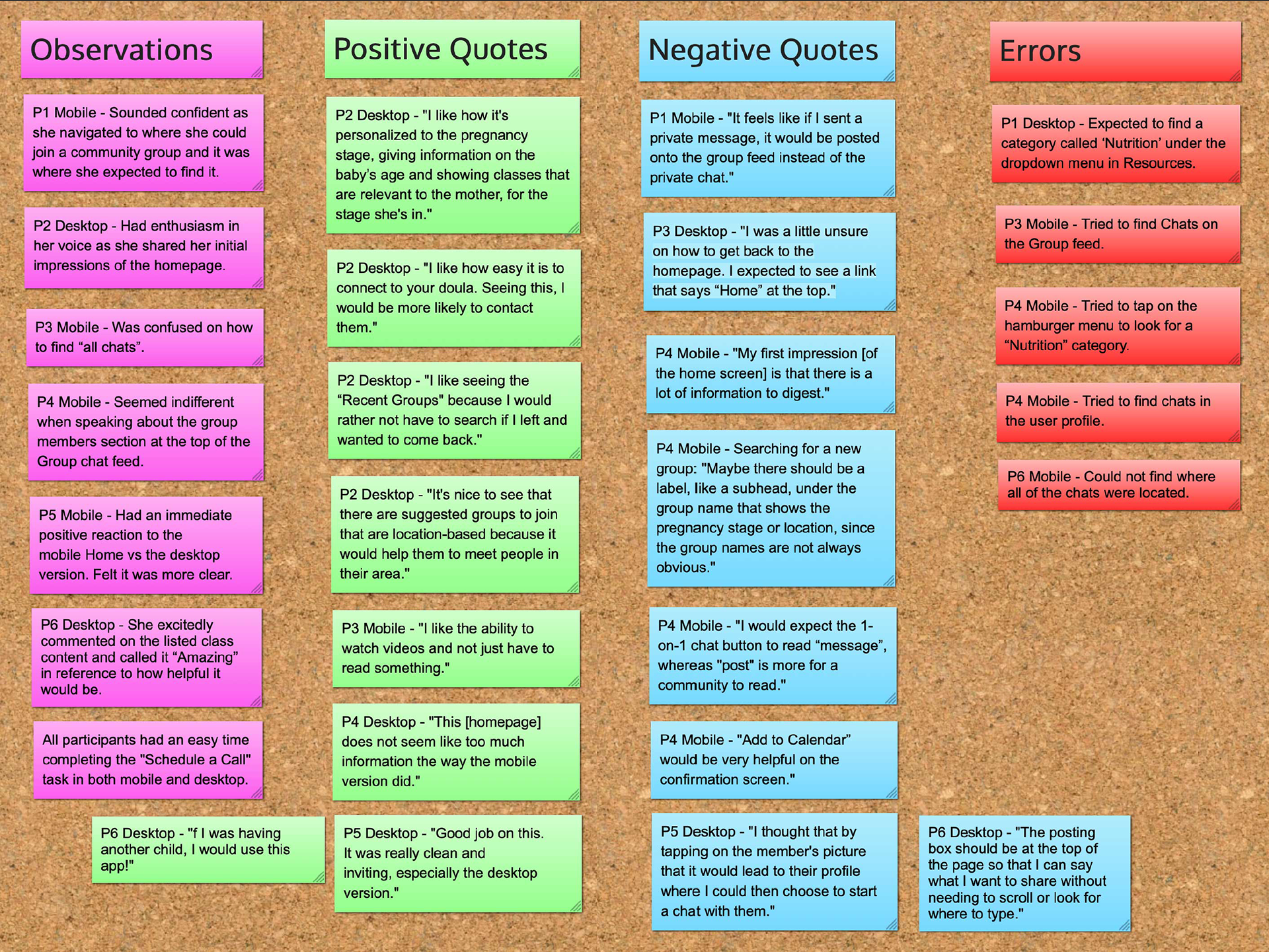
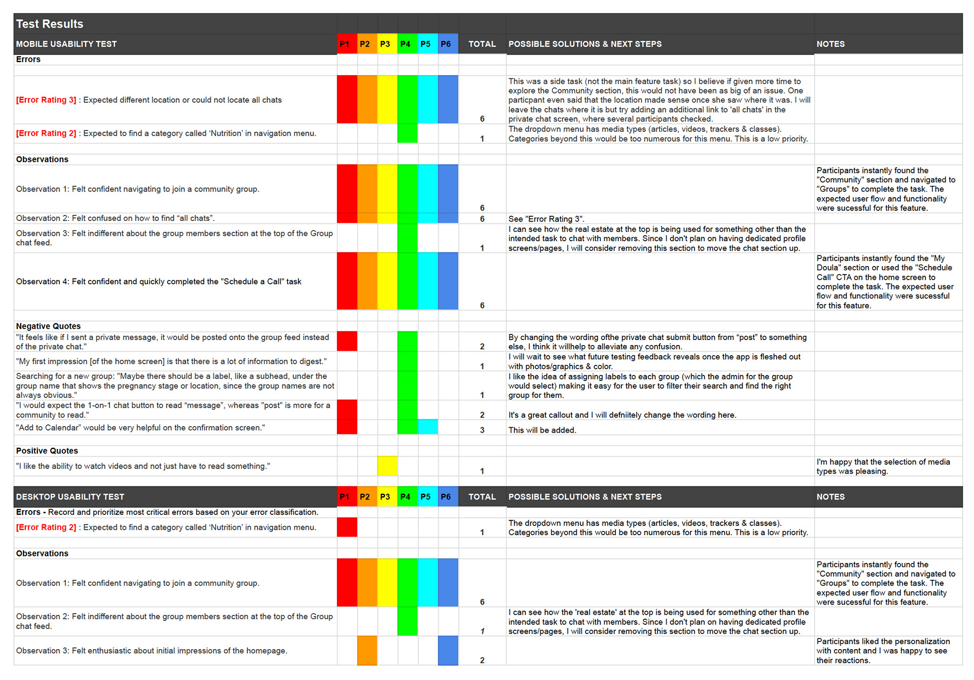
After all tests were completed, I began extracting insights and arranged them into categories (Observations, Positive Quotes, Negative Quotes & Errors) to help me notice any themes. I also made a Rainbow Spreadsheet to classify the important observations and errors in a visually organized way. Using Jakob Nielsen’s four-step rating scale, I determined the severity of changes required.
Fixing Usability TEST Errors
I had some great feedback for making improvements to Maternal, especially for the Community feature. I went through each of the noted issues and updated the designs.
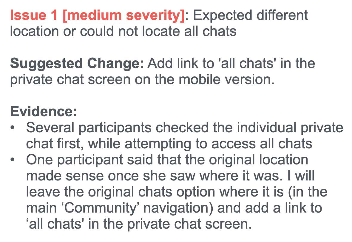
Error Findings
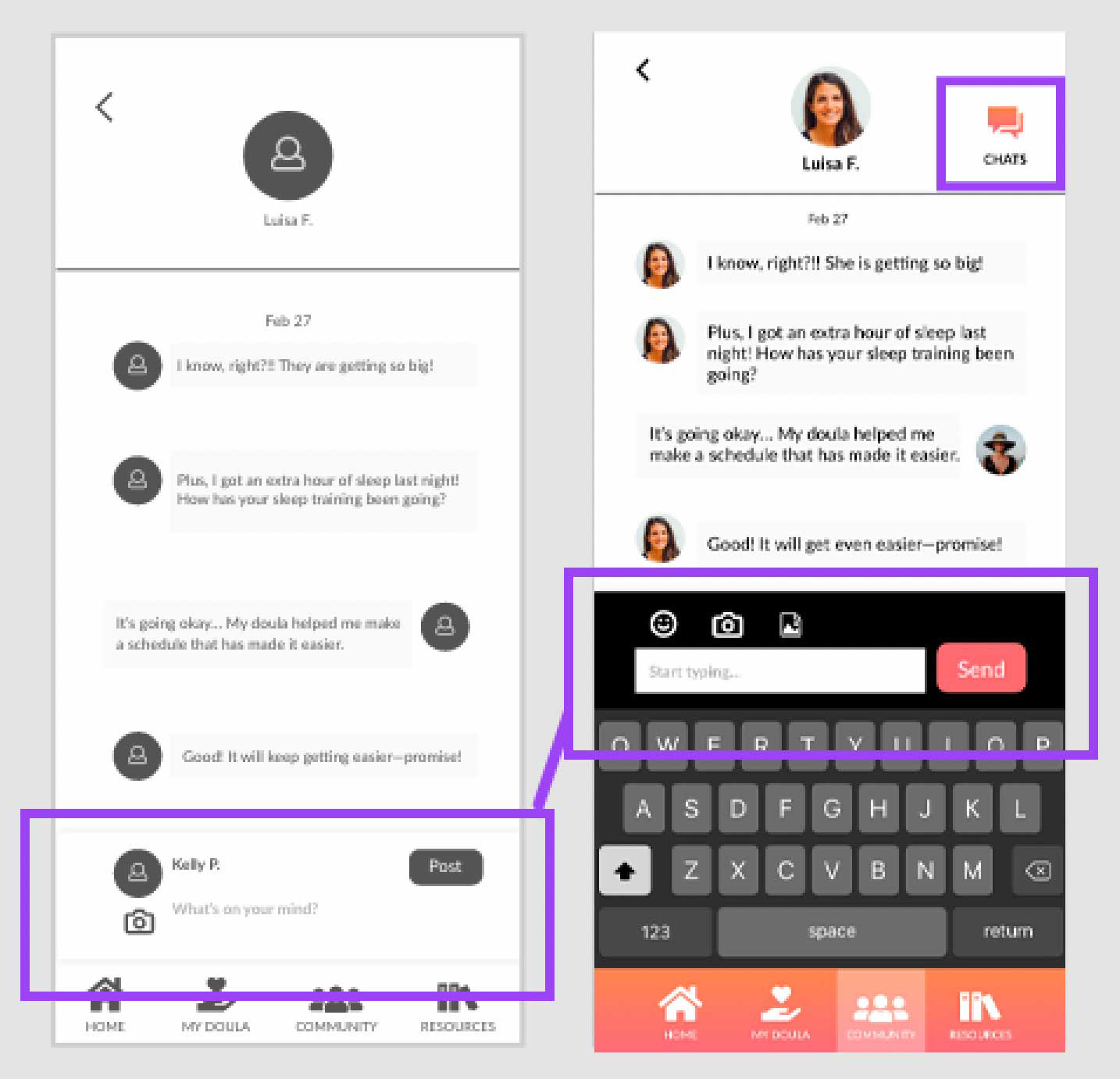
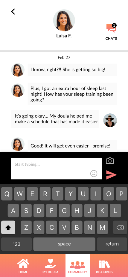
Revised Private Chat Box & Added Chats Link
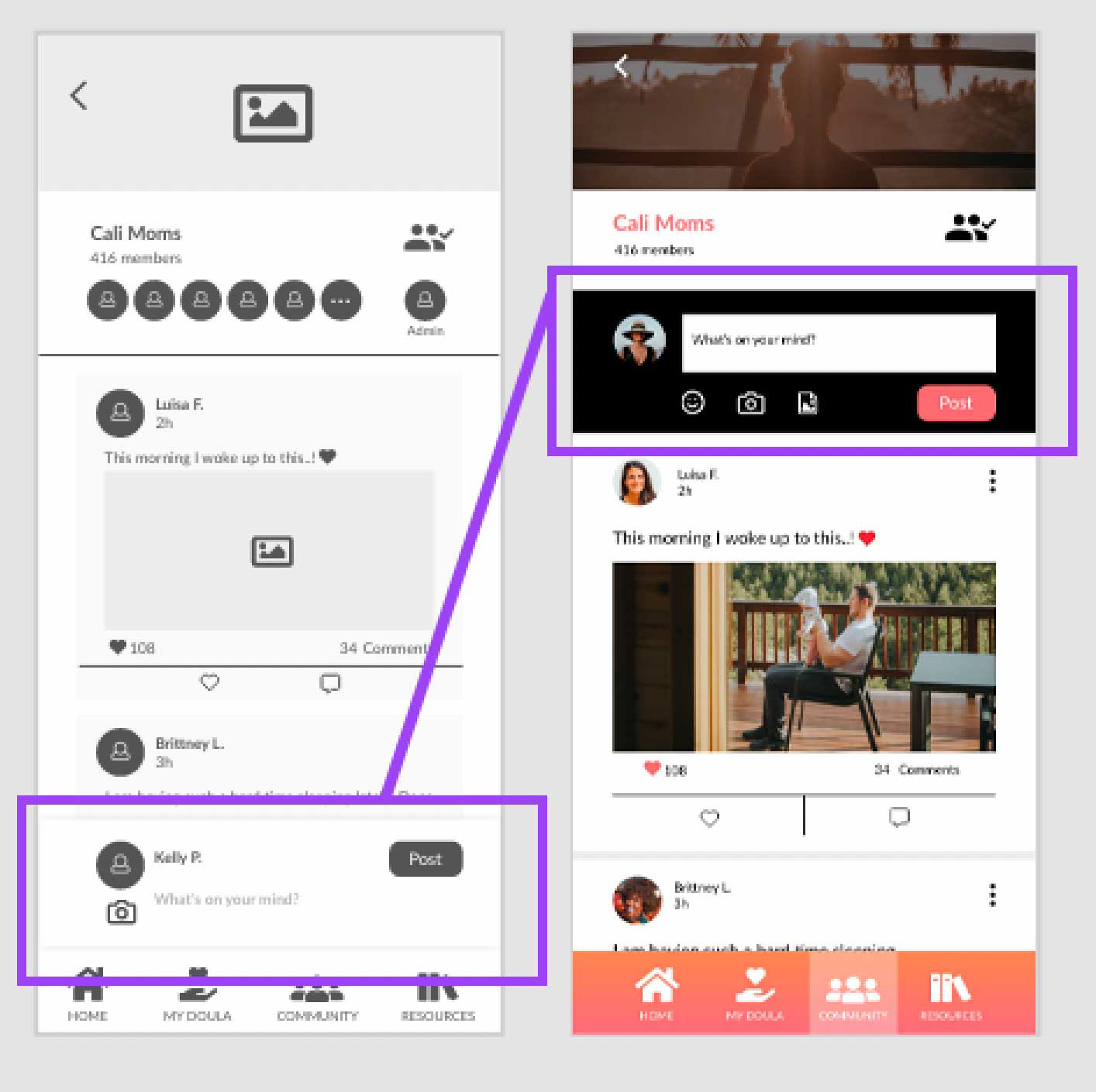
Revised Chat Box
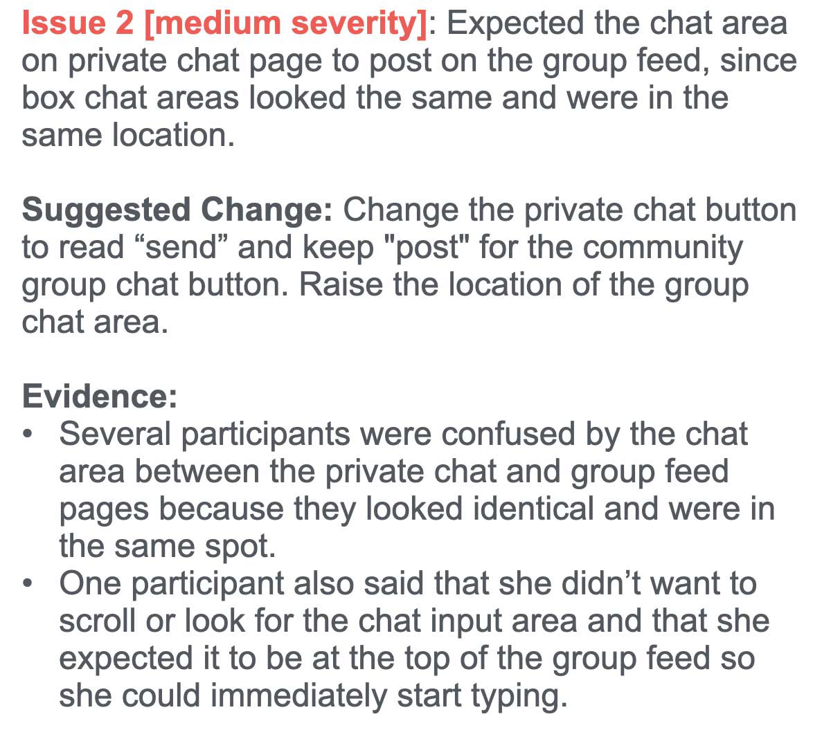
Error Findings
A/B Preference Tests
I continued to refine the app and conducted preference tests for the intro & onboarding screens. There was a clear winner for the intro screens, with feedback supporting a natural photography approach with less all-over color.
Intro Screens
Intro - Version A - "Too Pink"
Intro - Version B - Winner - "Clean & inviting"
Onboarding
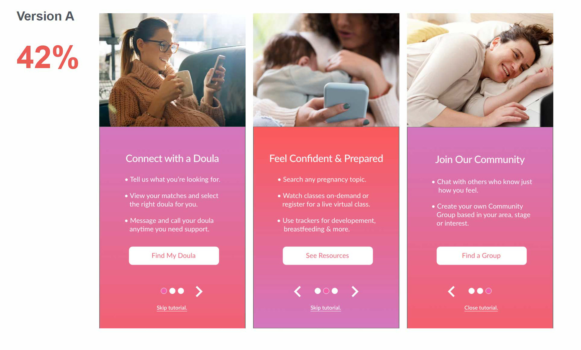
Version A - "Warm and welcoming"
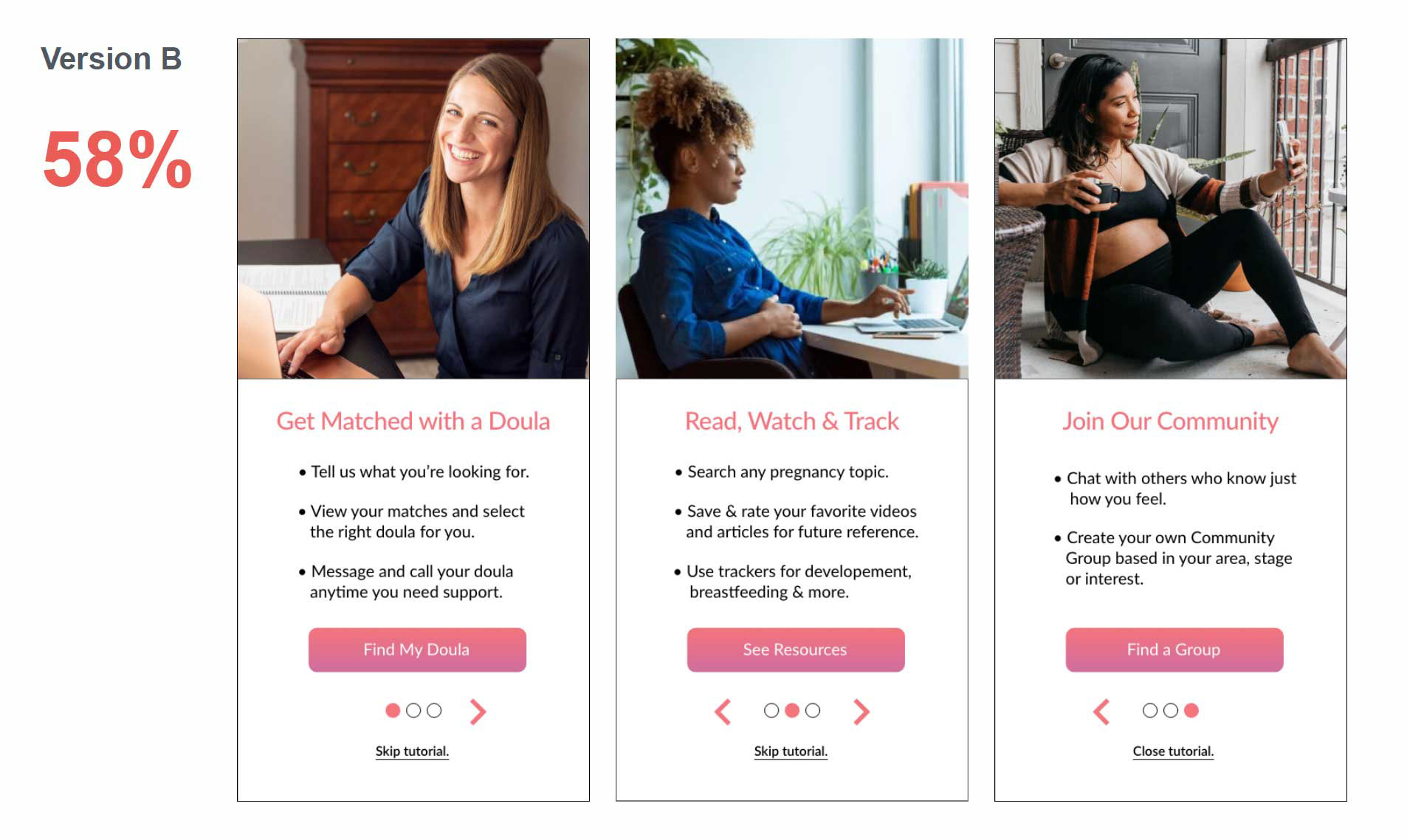
Version B - "Simple and clean"
The results of the onboarding preference test were more mixed. The feedback supported having more color to grab the viewers attention. I took a hybrid approach and adjusted the color palette of the gradient (participants did not like the pink tones) and added some white back to the screens to flow with the winning intro design.
Hybrid Onboarding Design (based on feedback)
Design for Accessibility
Once my main feature screens were designed, I scheduled a review with my mentor. During the review, my mentor noted that the mobile navigation state was probably too subtle to pass an accessibility test. This was a great callout and prompted me to take another look at all of my screens with an accessibility lens. I switched the navigation's active state to an inverse to maximize contrast.
before (top) & after (bottom) - navigation
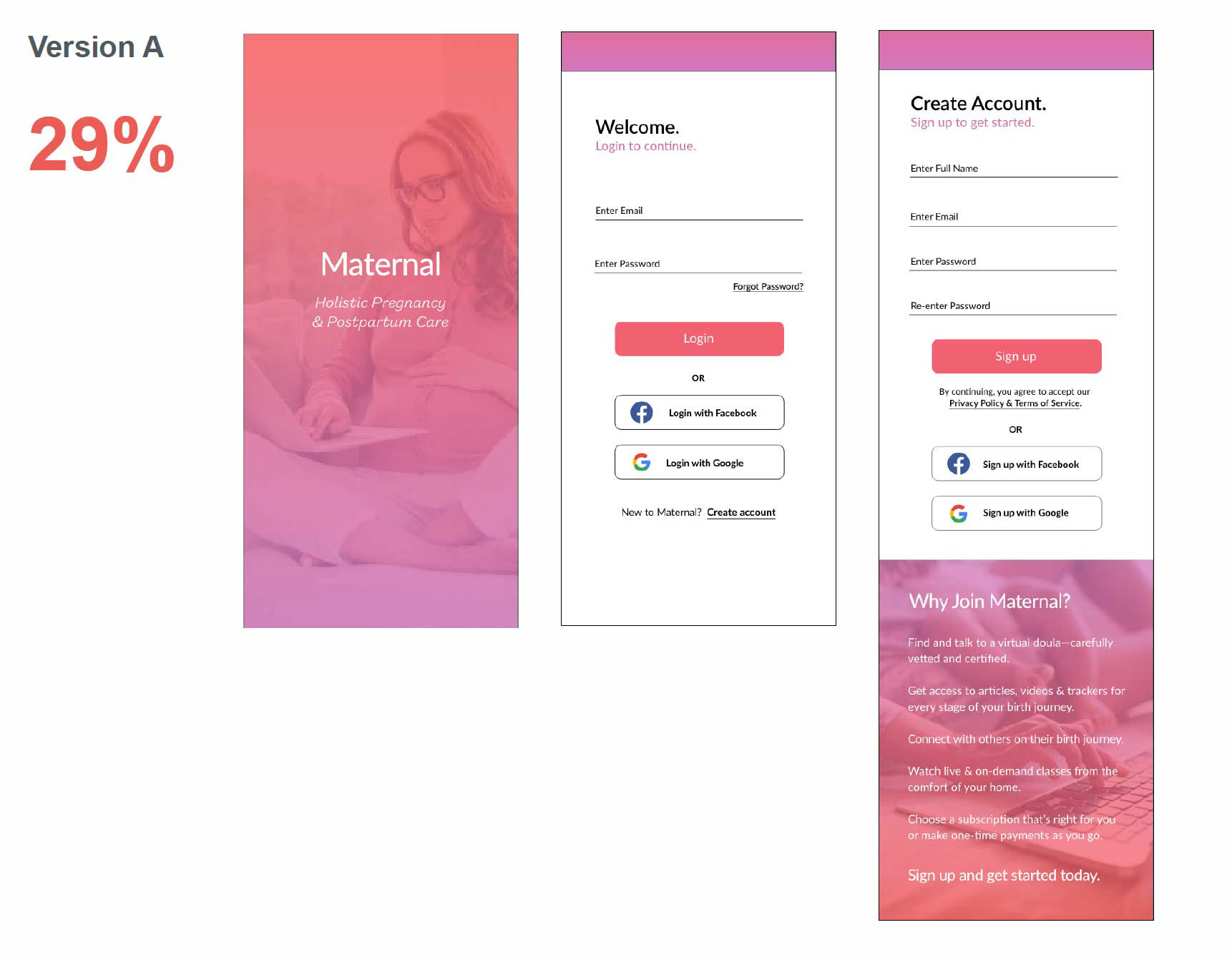
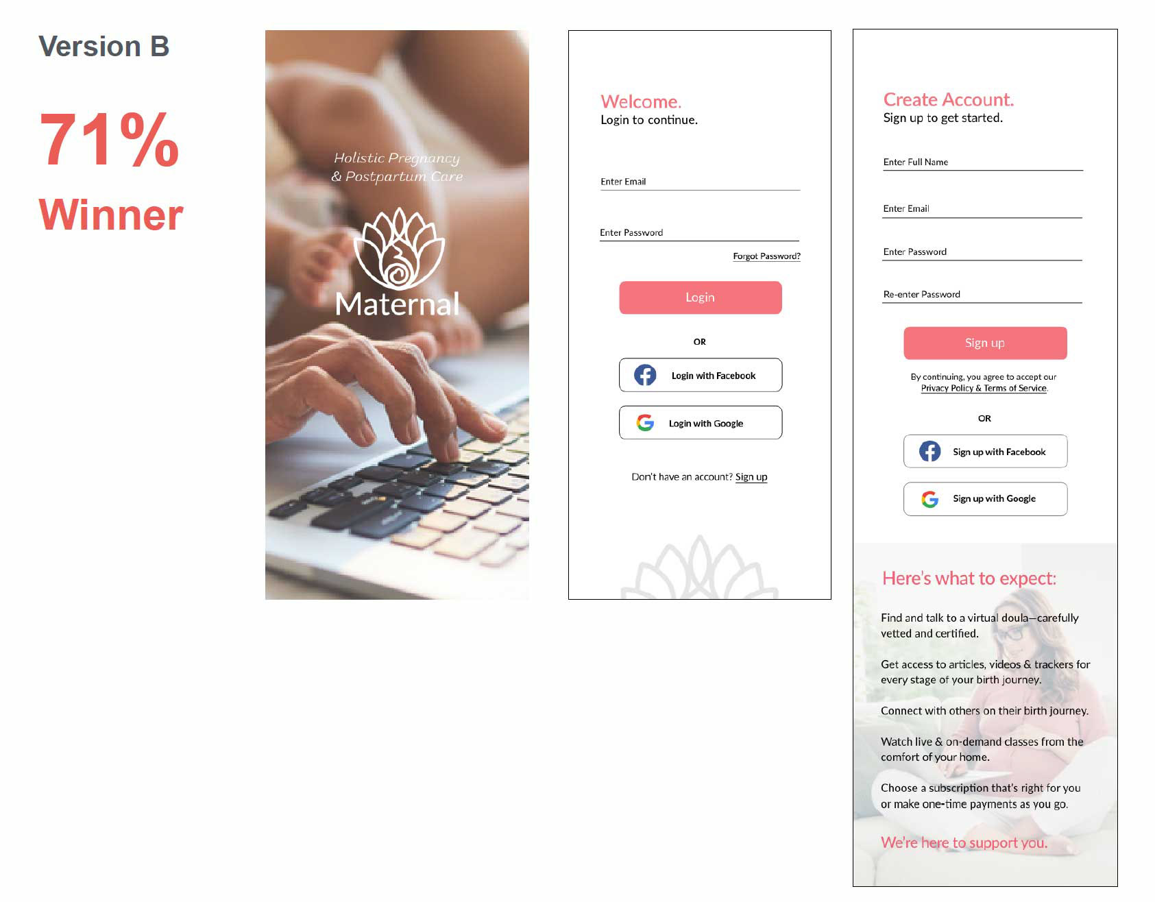
Per WCAG Guidelines, I updated all form fields with clearly defined outlines, placeholder text and labels. Font sizes were also increased and the button text was made bold.
Finally, I updated the “What to Expect” section by replacing the background image with the brand’s sunset gradient to grab the users attention and add more contrast.
before (left) & after (right) - login/sign up
Design language
After researching Material Design and iOS Guidelines, I created a style guide and design patterns document for any shareholder or developer to follow.
Design deliverables
In Adobe XD, I exported the assets that my developer would need for their build. Also included: prototype link, wireframes and the style guidelines document.
packaged Design deliverables for developer handoff
I used naming conventions that describe the file and how it relates to other files.
Naming conventions
Final DESIGN
After some great collaboration and testing, the final app design will welcome and support all of our pregnant and postpartum moms along their journey.
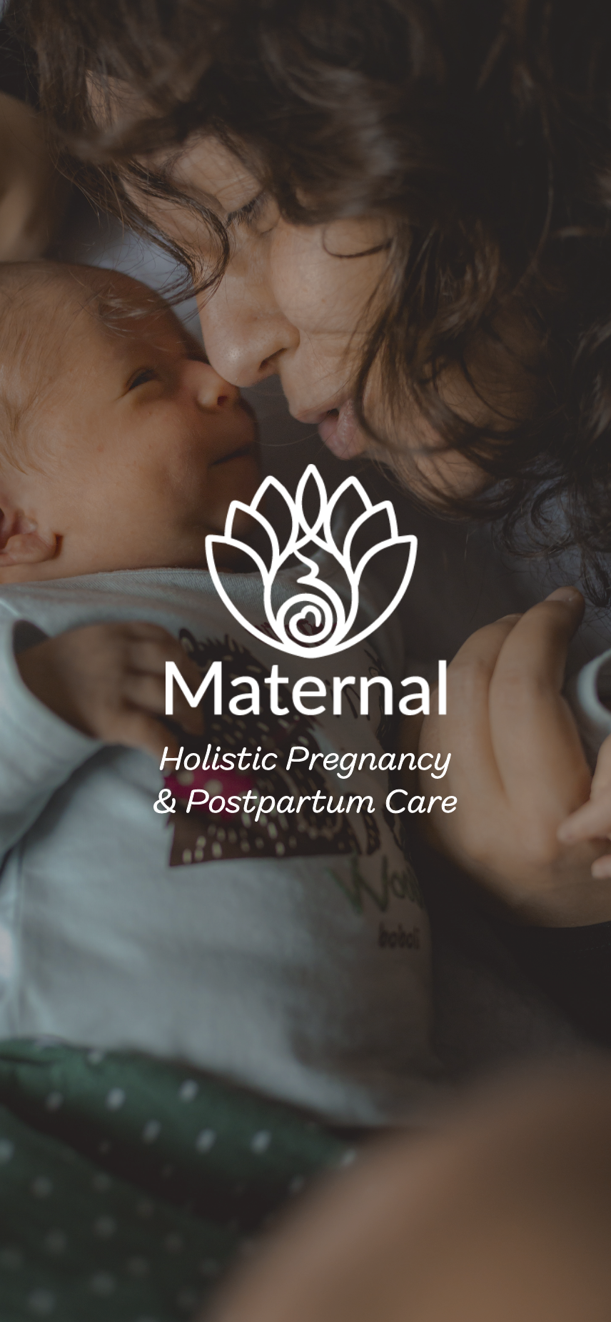
Splash
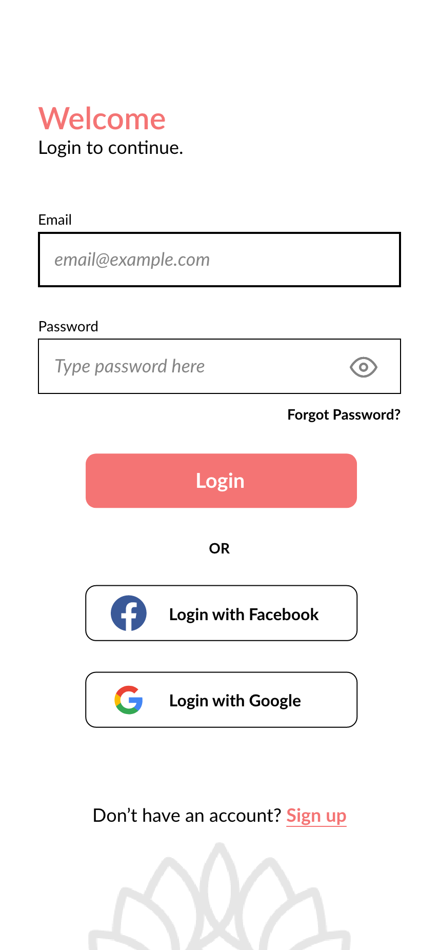
Login
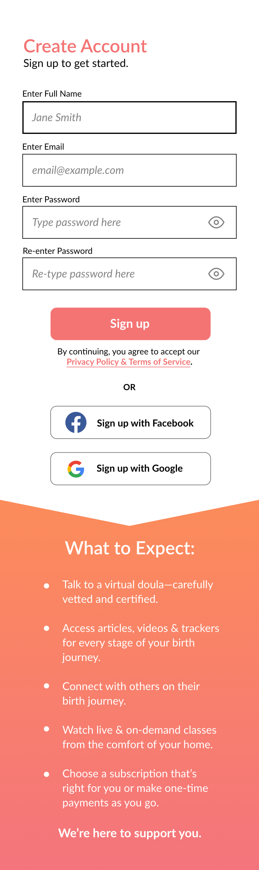
Sign up
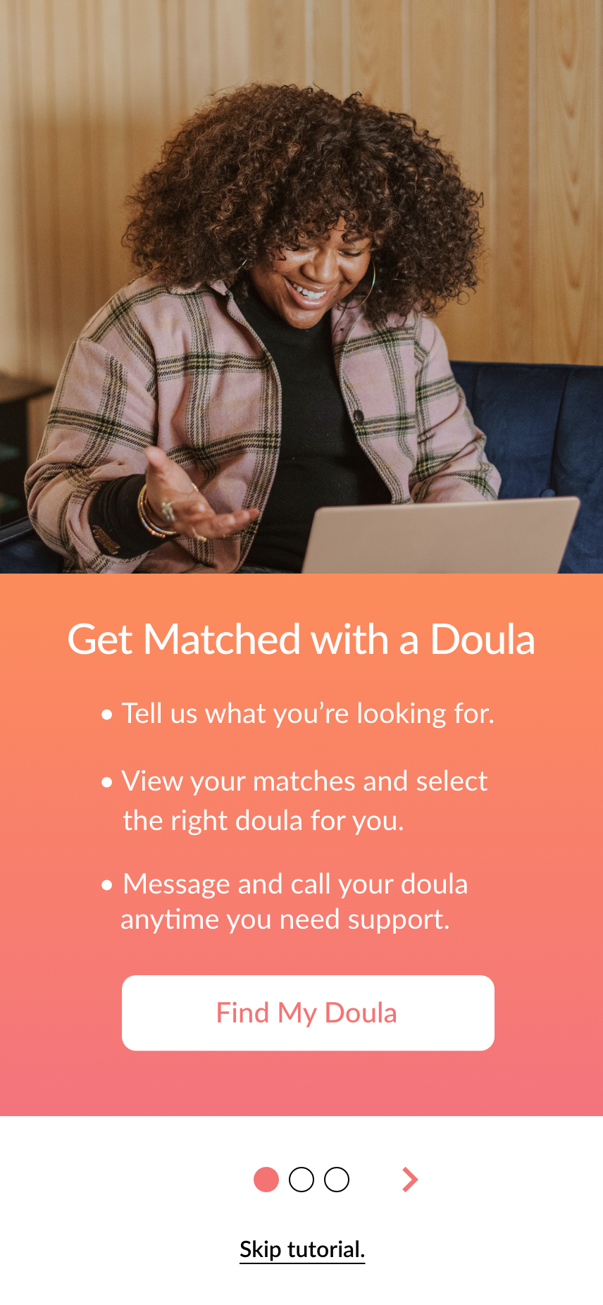
Onboarding 1
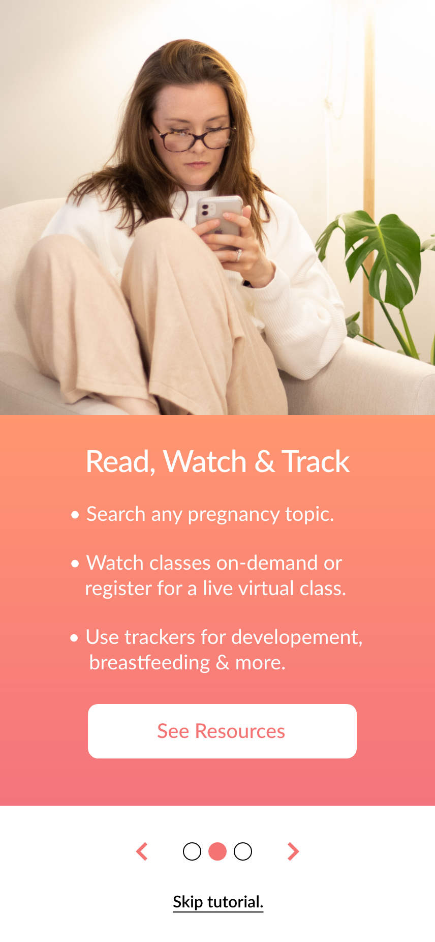
Onboarding 2
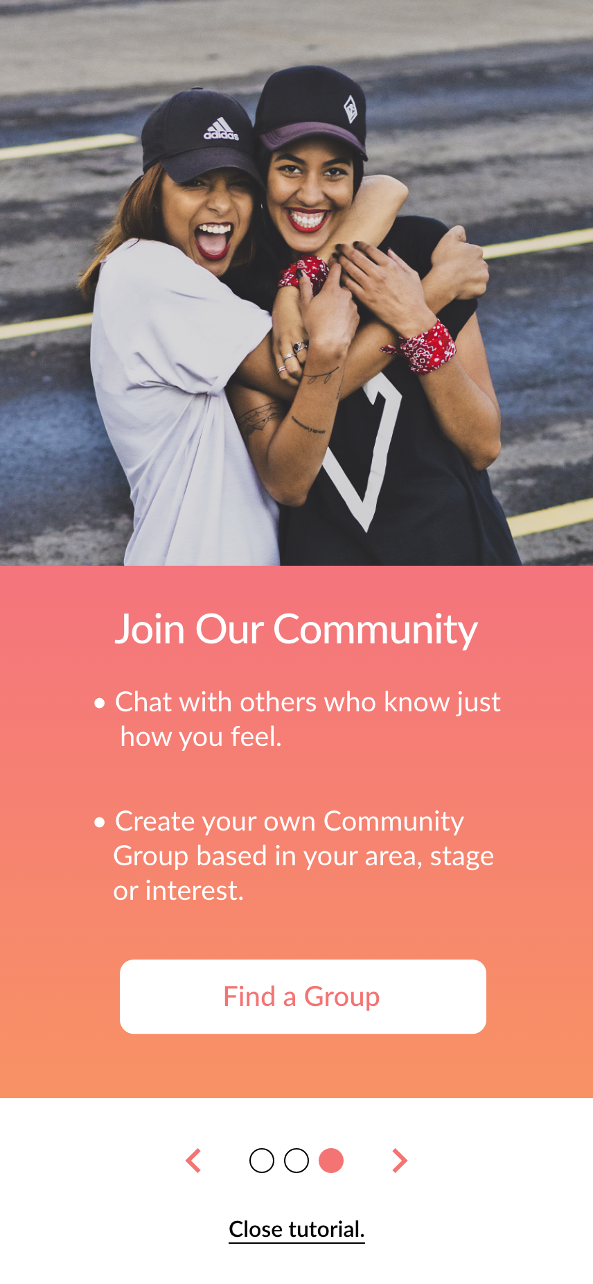
Onboarding 3
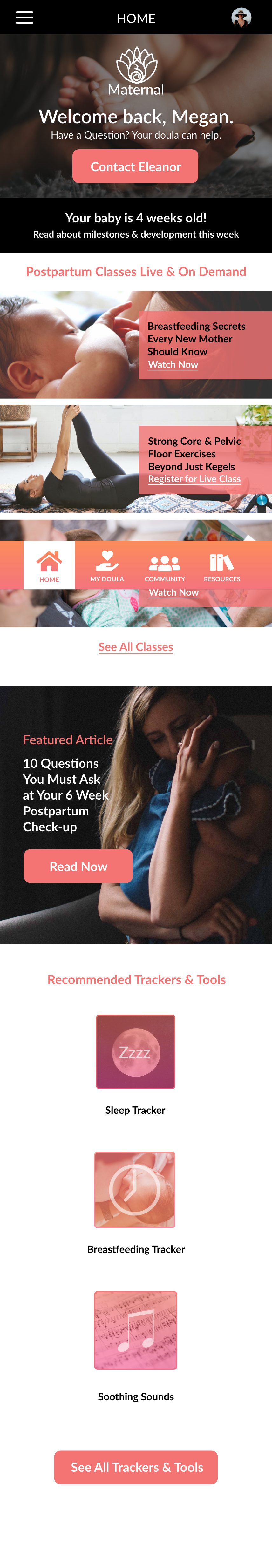
Home (mobile)
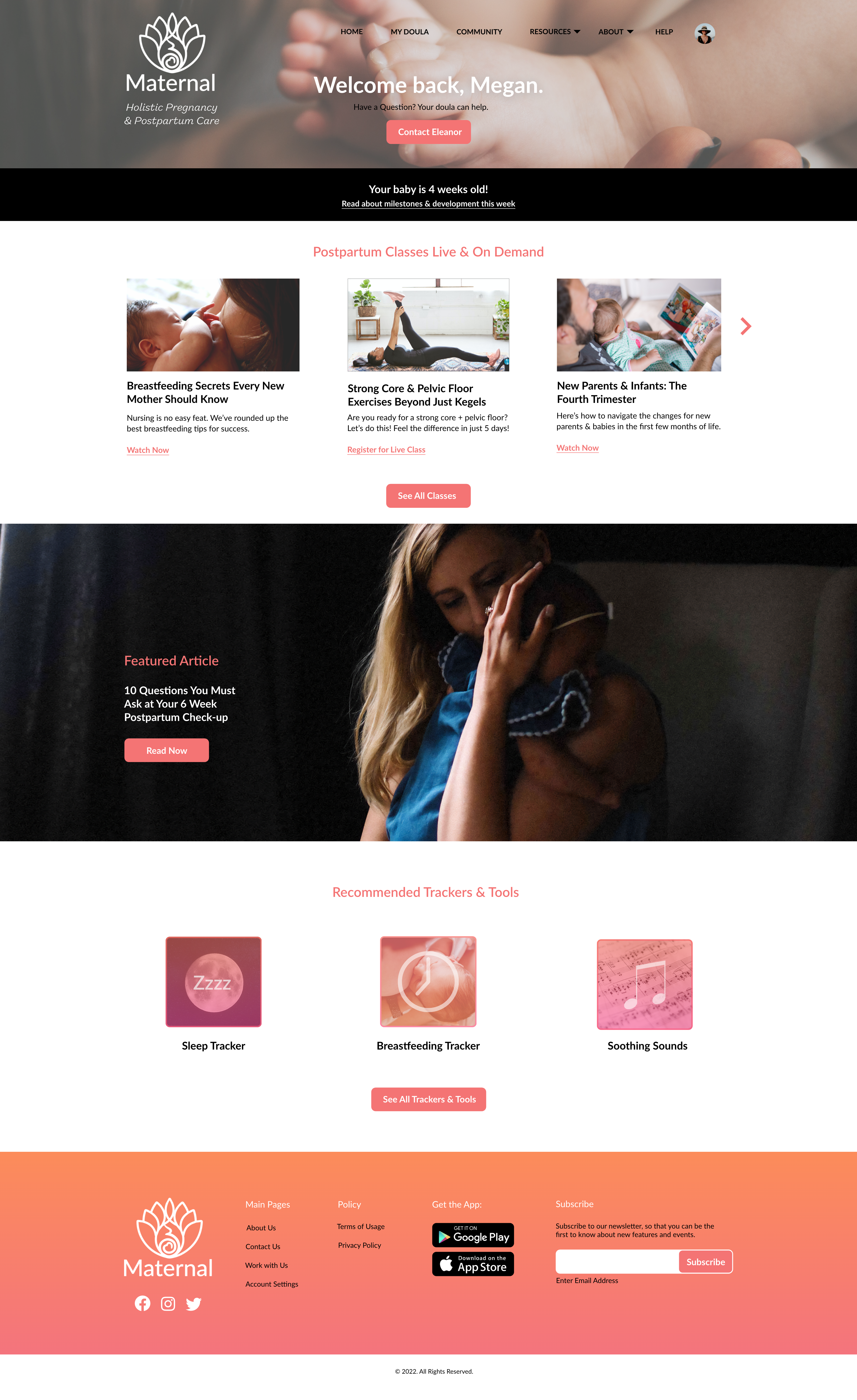
Home (desktop)
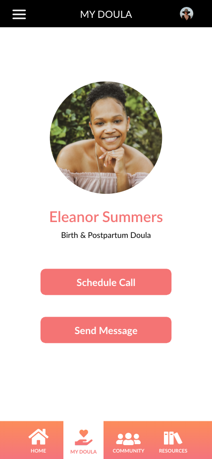
My Doula
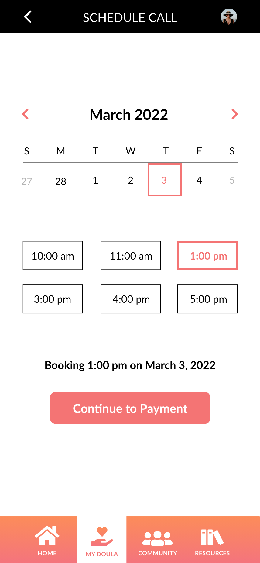
Schedule Call
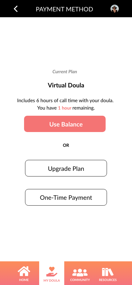
Payment Method
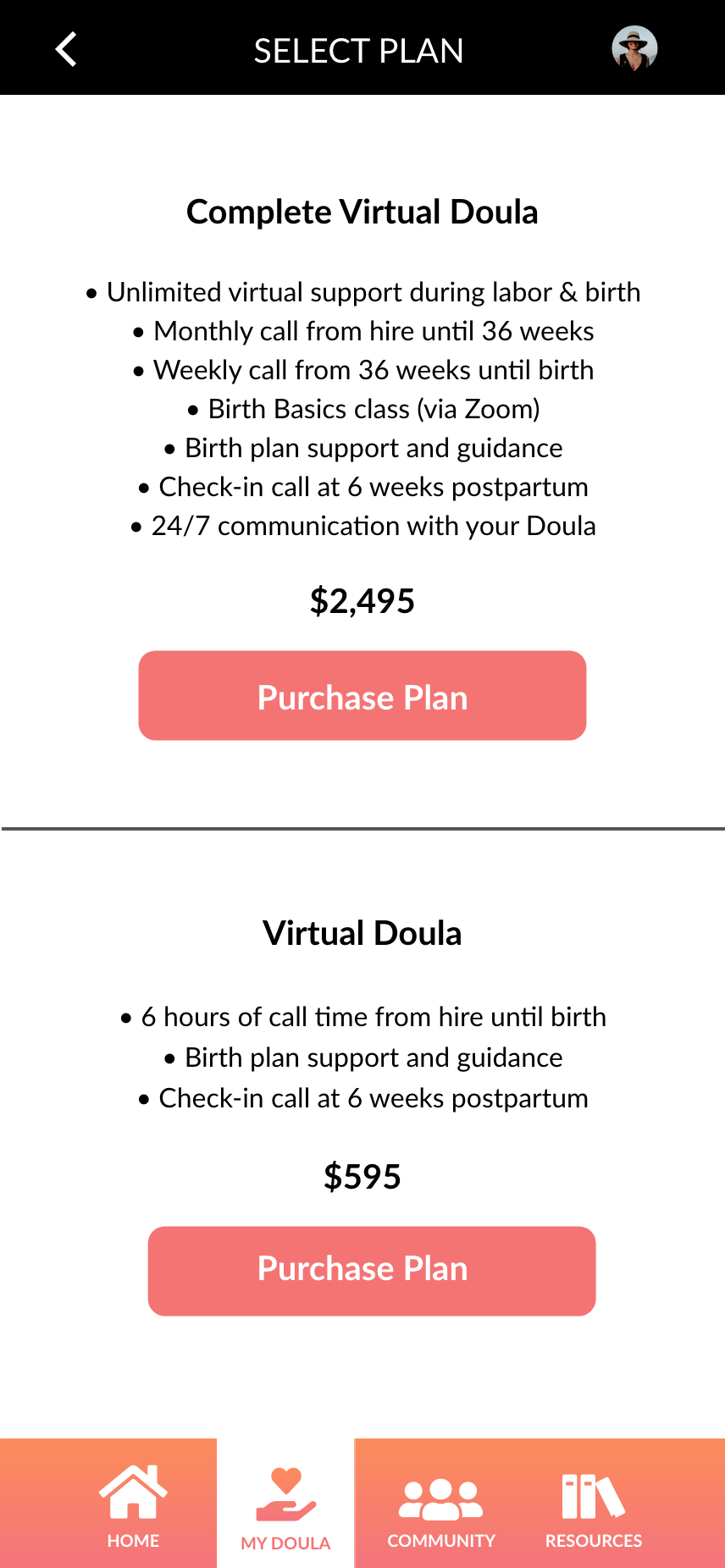
Select Plan
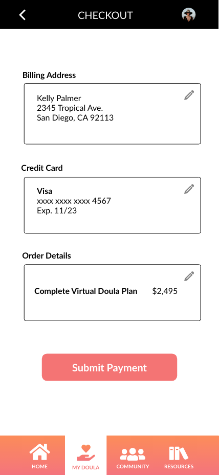
Checkout
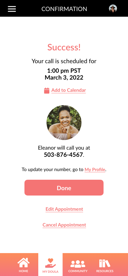
Confirmation
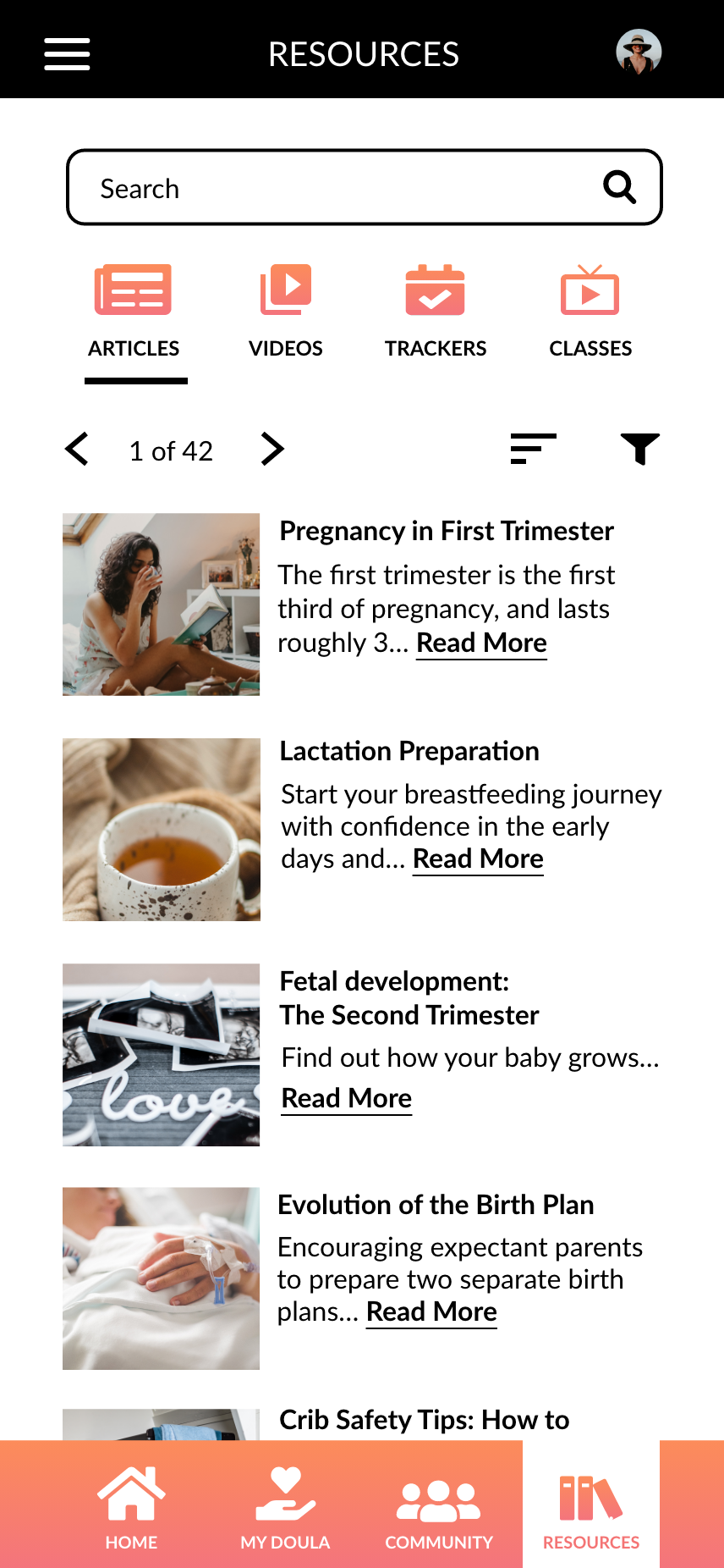
Resources
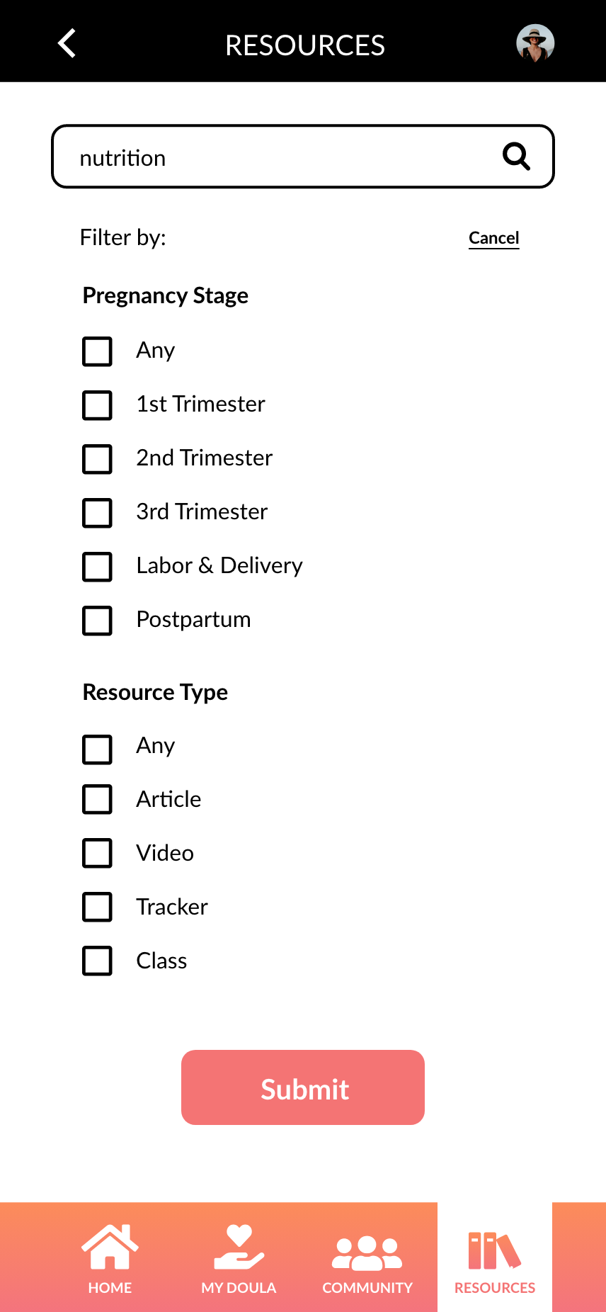
Filter Search
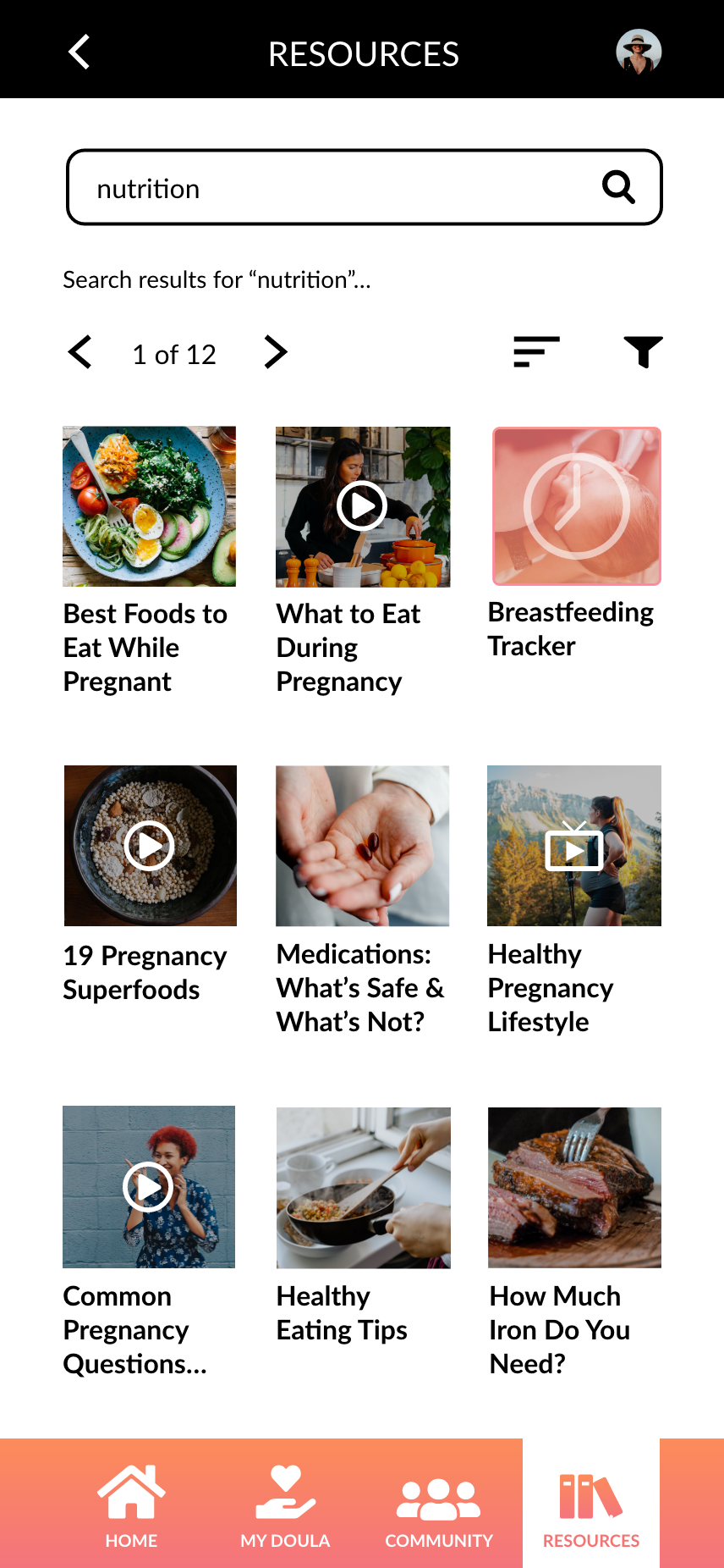
Search Results
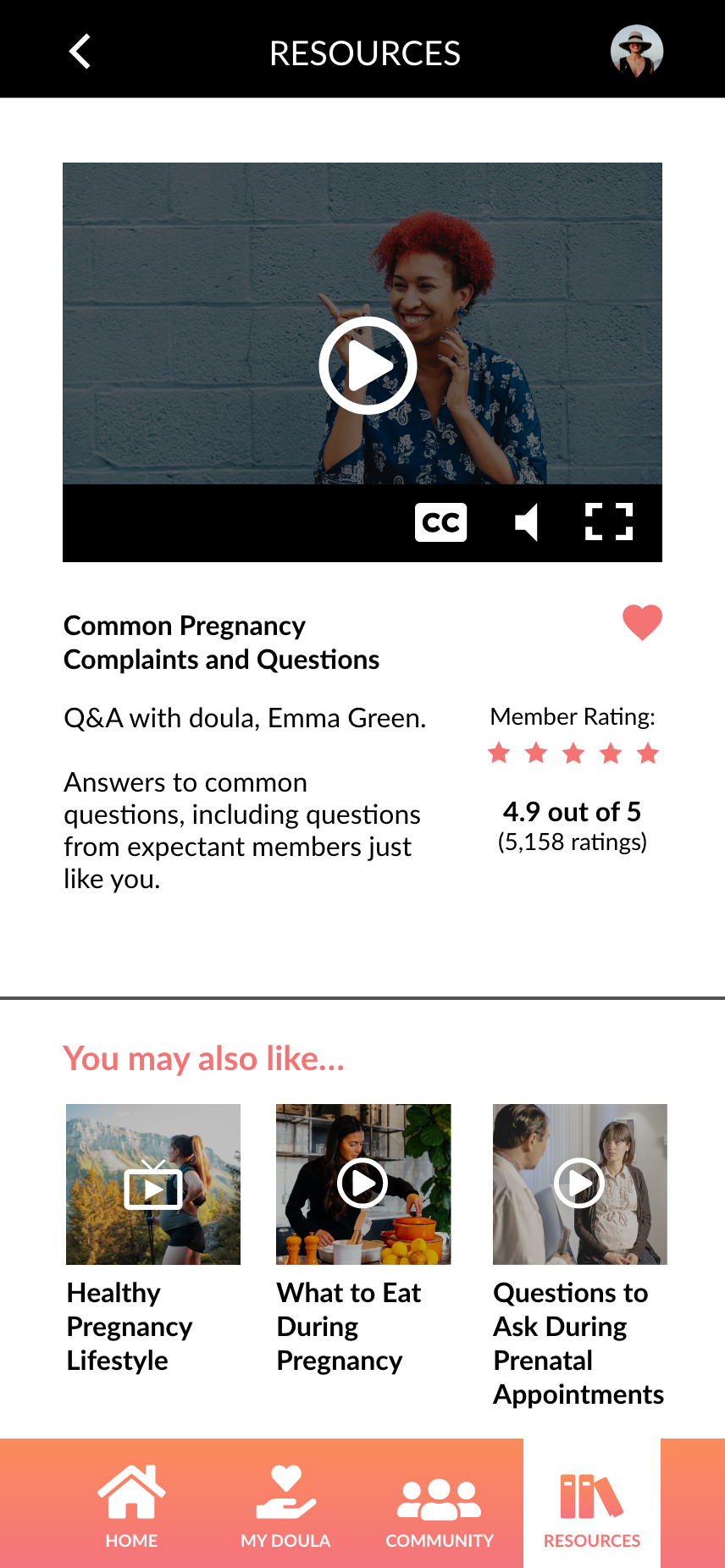
Read/Watch
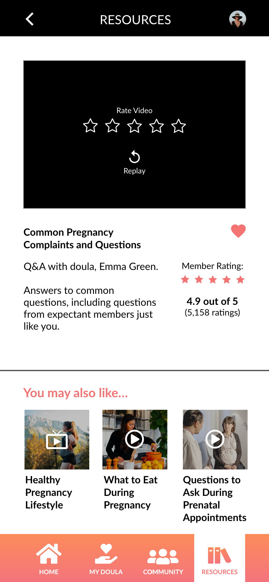
Rate Video
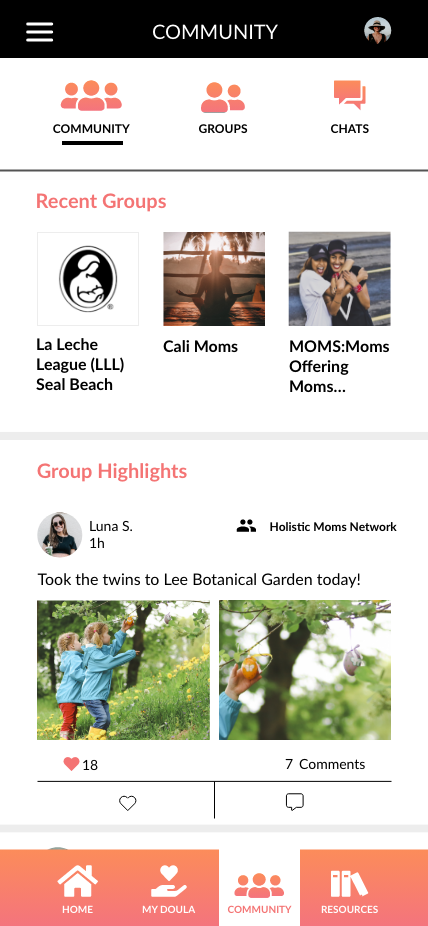
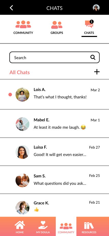
Community
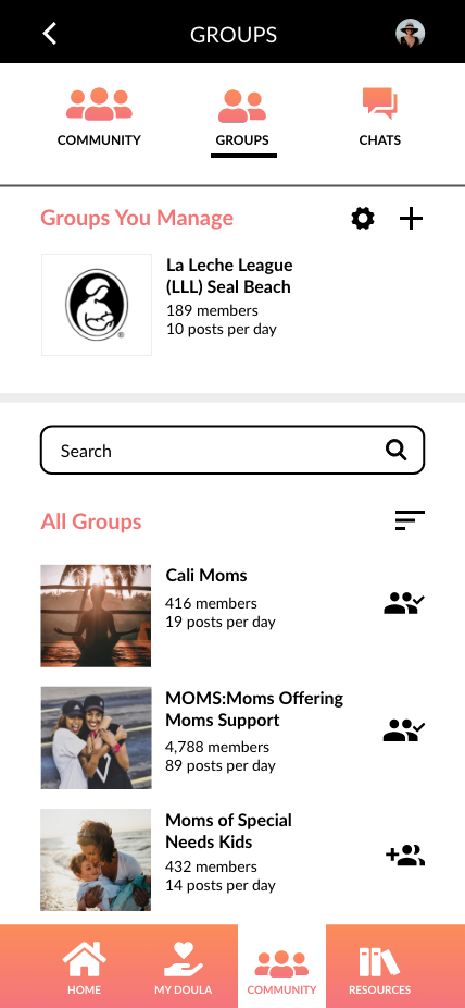
Groups
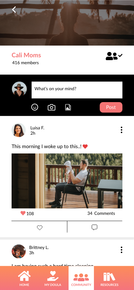
Cali Moms' Group
Private Message